How to Make Your Building Material Marketing Pieces Work Harder

How to Make Your Building Material Marketing Pieces Work Harder

Achieving Synergy by Leveraging High-Quality Videos & 3d Renderings


Before we get started, let me just say…

It was hard NOT using the word “synergy” in the title of this post. It’s one of those corporate-sounding throwaway buzzwords that’s been done to death. Which sucks – because it does a good job summarizing what we’re talking about today.

Synergy in your marketing is two or more initiatives working together to create a response greater than the sum of the elements alone. That’s according to a definition I found at smallbusiness.chron.com.

With traditional marketing methods, you end up paying twice for a marketing piece – once for its design and production, and again for the placement in the media of your choice (magazine, radio, trade journal). But you only get a single return from each effort.

However, done right, your marketing today can be paid for just once, but continue to provide you with returns virtually forever. That’s especially useful if your company has a limited marketing budget…

“Big doors swing on little hinges.” – W. Clement Stone

So how does this all apply to high-quality visualizations?

When you invest a portion of your marketing dollars on a few well-considered visual pieces – details, animations and 3-D renderings of your product – you create synergies between your sales & marketing materials and your technical documents.

What that means is you’re…

  • Making your marketing materials more technical, but still aesthetically pleasing…
  • Creating engaging and attention-grabbing technical pieces that are marketing-oriented…
  • Adding “why statements” to your technical pieces to get in front of your prospects questions

To give you a better idea of what we’re talking about here, let’s take a look at how some of the larger building product companies have been successfully using videos and renderings in an expanding way.

Nichiha

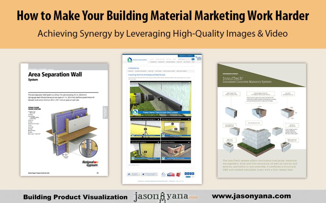
Nichiha, the fiber cement product manufacturer, does a great job of re-purposing their visualization throughout their marketing, sales and technical documents.

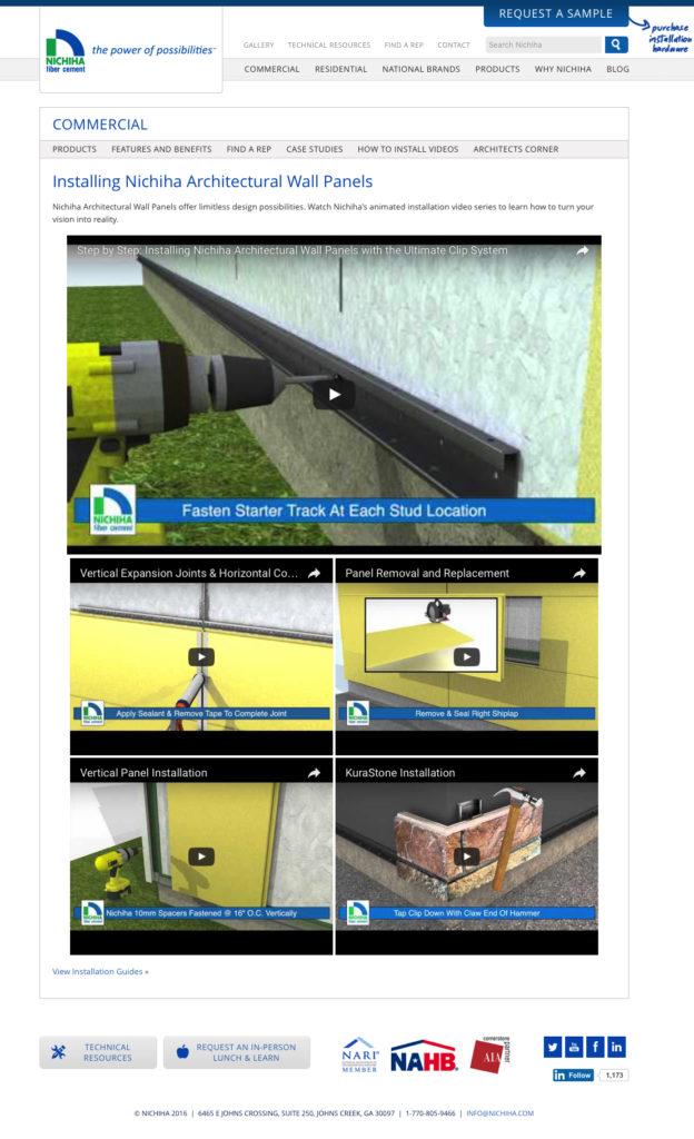
Not only are they using animated installation videos on their website to demonstrate the installation of their product lines to architects and contractors…

Screenshot 01 - Nichiha Video page


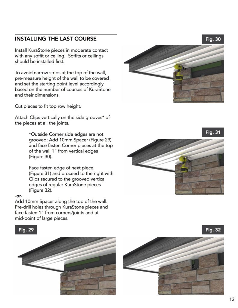
…They’re also combining video screen shots with photographs and 2D details in their installation instructions to clearly demonstrate to installers every step needed to provide a great project…

Screenshot 02b - KuraStone_InstallGuide

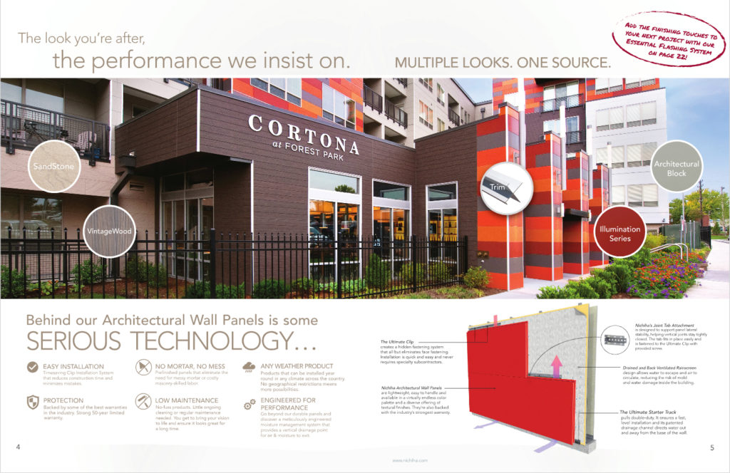
…You’ll also find their pulling 3D renderings into their brochures and other sales documents and weaving them between their sales copy and beautiful project photos.

Screenshot 03 - Kurastone Catalog

It’s through this synergy that they effectively & successfully demonstrate how their products can work as part of the architects next project… While also creating a consistency that runs through all of their forms of communication with their clients and installers.

Oldcastle – Echelon Insultech

Let’s look at another great example: Oldcastle’s Echelon masonry product – Insultech.

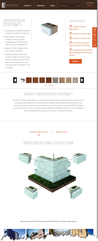
For their Insultech product line, since it is one of those “behind-the-scenes” products, project photos don’t do it justice. That’s why it’s critical that they use a variety of images to demonstrate the product’s features and benefits to their clients.

It all starts on the website’s product page, where they use a variety of 3D rendering and details to illustrate the product…

Screenshot 04 - Insultech Product page

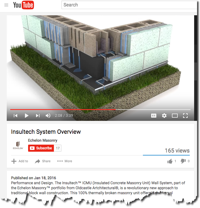
If you happen to check out their YouTube channel, you’ll find they use a combination of live product demonstrations with 3D renderings and CAD drawings to properly demonstrate their products value.

Screenshot 05 - Insultech YouTube page

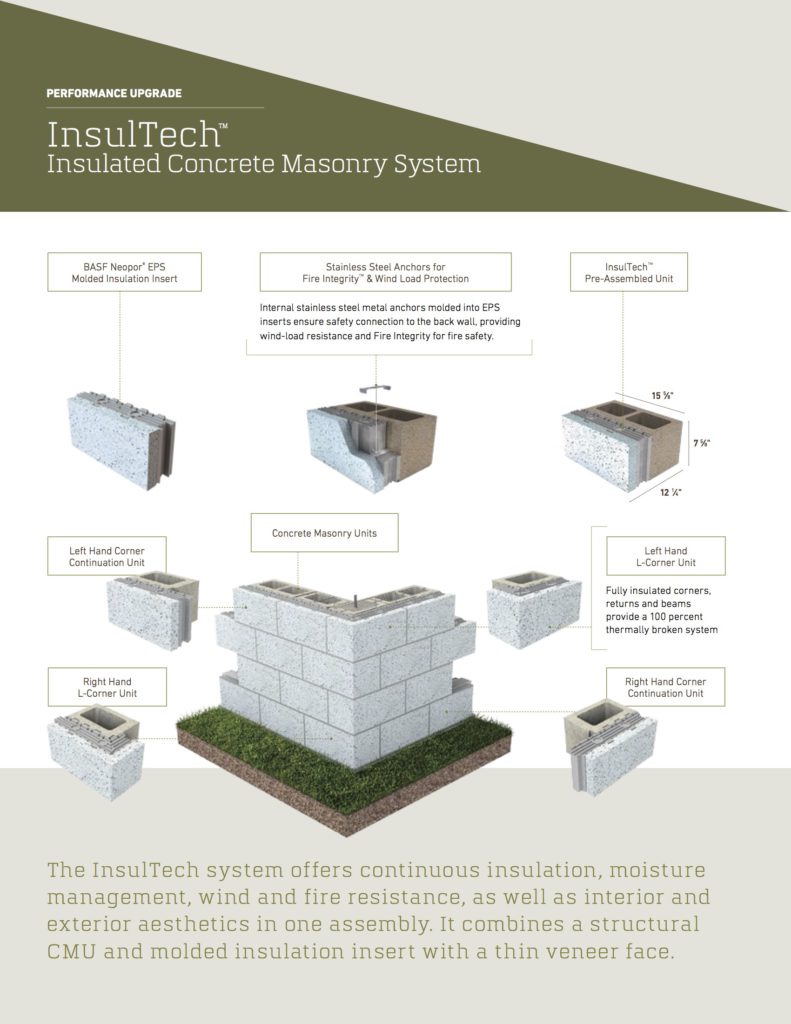
In their Masonry Performance Upgrade catalog, their also using similar version of these 3D rendering to explain each of their upgrade options. And, again, we see they’re weaving the images together with sales copy, project photos and technical drawings.

Screenshot 06 - performance_upgrade_catalog_06

Throughout their marketing and technical documents, Echelon is doing a great job of utilizing the many small pieces they’ve collected and are using them effectively across their website, their leave-behinds, and the rest of their media sources.

National Gypsum

For today’s last example, I’m highlighting the work that National Gypsum is doing. They’ve spent a lot of time and effort developing a library of product drawing, details, and animations to clarify their product lines.

(…By the way, I just finished putting together a case study of the work we’ve done together, so if you’d like to learn more, send me a quick message and I’ll email you the PDF…)

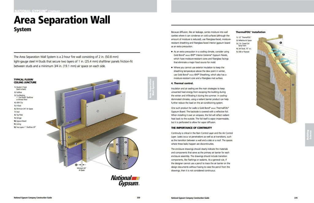
National Gypsum’s most comprehensive incorporation of the many small pieces and parts that they’ve generated and collected are brought together in their newly-released (circa June 2016) “NGC Construction Guide.”

Throughout the almost 400-page guide, they’ve brought together all of the technical details, renderings and images to clarify their extensive product lines. I’m honored to have been part of the development of the visualization pieces. Here are a few pages from the guide…

Screenshot 07a - NGC_ConstructGuide-2up

As an architect or contractor goes through the National Gypsum website, or any of the other marketing channels NGC uses, they’ll see a consistent use of the many visual pieces they’ve developed over time.

It’s through this consistency, that National Gypsum has developed an effective strategy to communicate the value their products provide, and how their clients can use those products to create the best project possible.

Conclusion

As you can see, investing in a few high-quality product renderings or videos to weave throughout your marketing and customer service strategies can be scaled as much or as little as you want.

Your strategies can adjust as your marketing budgets fluctuate. But each of these pieces can be repurposed throughout all of your communications with your client. The options are unlimited.

So get started building your library today.


Speak to the Crocodile Brain to Market & Sell Building Materials Effectively

Speak to the Crocodile Brain to Market & Sell Building Materials Effectively

Marketing products effectively and consistently require understanding the buyer’s mind; this involves a depth of knowledge about how the brain operates. Many marketers may think of the brain in terms of psychological definitions, but there is a large difference between the mind and the brain.

The mind evolves from environmental shaping and experiences, whereas the brain is pure chemical and physiological matter. Oren Klaff, the author of Pitch Anything, explains that it is imperative to speak to the crocodile brain to market building products and building materials more effectively.


sell more building materials


What exactly is the crocodile brain?

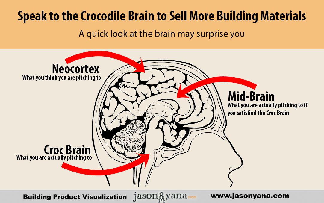
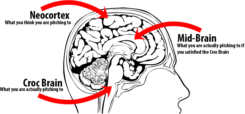
There are three parts of the brain: Neo-cortex (frontal), mid-brain, and the crocodile (reptilian) brain. The crocodile part of your brain, although beneath and behind the neo-cortex and mid-brain (both of which take up more space) is the first to receive information from outside sources.

It must decide what to do when confronted with a person, situation, visual stimuli, and so on. In other words, this part of the brain is the first to receive marketing visuals and information, and it will either pass it on to the main part of your brain or ignore it.

No new information ever gets to the rest of the brain (the place where someone will decide that they want your product) without passing through the reptilian brain.


How can I get my marketing materials past the crocodile brain and on to the neo-cortex?

This is the ultimate question and the most important; if the crocodile brain of the buyer decides to ignore your message, visual, or pitch, then your product will not sell. It’s important to understand how the crocodile brain thinks or works in order to get through on its level.

Here are characteristics of the crocodile brain, which, when analyzed give a perfect guide to marketers on how to present their material:

  • Driven by survival.
  • Filters out all extraneous data.
  • Selects only information received fast and summarized.
  • Looks for strong contrast cues (this can be in words or visual images).
  • Seeks visuals and narratives.
  • Ignores the ordinary/desires the unique (the survival mode says if something is ordinary or familiar, it is to be ignored because it’s not essential to survival. Only something perceived as unique, different, or dangerous will be passed on to the neo-cortex brain).


By understanding the workings of the brain, marketers can tap into greater selling power. When developing visuals, digital marketing material, or other advertising items, speaking to the crocodile brain means getting your message all the way through.

Bottom Line – don’t let the crocodile brain hijack your building material marketing message

Your message must be :

  • Simple, Clear and Big Picture –  distill the conversation down to the core and filter out all the other details, those can come  later . . .
  • Unique and Positive – The information you are giving the crocodile brain has to be new in some way, or it won’t even be noticed.  Giving a hint that something great is coming if they keep paying attention.

Some things to think bout when you are considering how to approach explaining your products to your target audience.

How can you use this information to hone your message today?  right now?

Regards and I hope you find beauty today, even in your crocodile brain.

-Jason Yana

About the Author :

Jason Yana has 2 decades of experience in architectural technology, 3d graphics and construction marketing. This unique combination provides highly-effective visual representations of building products that fuel marketing and support efforts.

His award-winning body of work informs, inspires and educates building product customers.

Make Your Building Materials Web Site Resonate With Architects

Make Your Building Materials Web Site Resonate With Architects

6 questions you should be answering to get more quality leads


Is your building materials website currently doing its JOB? Is it attracting architects and contractors and then converting them into a good lead for you to follow up with?

I’m guessing not. Not that it’s your fault. You just did what everybody said you were supposed to do. Or you followed what it looked like everybody else was doing.

It doesn’t seem that long ago that companies were racing to get online. Just getting a website put up, so you appeared to be a viable company.

But as you’ve most likely seen, that’s just not enough anymore. Architects are increasingly looking to your website before anything else, as a way to decide if your product is right for them. So doesn’t it make sense to make sure your website has the information they want and need to make a decision. 

Now is the time that you need to step back and think critically about what questions you need to be asking yourself and others in your company. The questions that will help lead you to the answers to drawing more high-quality leads to your website and getting them to “raise their hand,” asking for more information.

Six key questions you should be answering…


1 – How does an architect choose one product over another?

According to a recent architect research report from Venveo, 70% of the architects surveyed said case studies are the most helpful type of content when deciding on what product to spec. The same amount of architects said they felt having a way to order product samples quickly and easily was another factor a manufacturer’s website should have.

According to building materials marketing expert, Mark Mitchell, when we look at what the primary motivation of most architects, their main concern is their reputation.

The overarching thing that helps an architect make the sometimes tough decision to risk their reputation and specify a new or unfamiliar product is to have a better understanding of it. Knowing how it works… How it fits into the overall picture of the building project they are designing…

If your website can help them get to that point of better understanding your product, then if and when they finally do call you, the conversation can be a much different one. Instead of starting at ground zero – explaining your product’s features and benefits – they’re coming to you with that base knowledge already in their head.

And they’ll just be looking for clarification on how your product can best solve their specific situation.

And as we’ve discussed before, in a previous blog post,  video is a proven way to get your prospects to understand your product.

2 – How does an architect research your products online?

Does he Google it, or does he go to an online product site like ARCAT.com, or Sweets?

If you’ve been reading my blog for a while, you’ve heard me talk about how the “old school” Sweets catalogs were the catalyst that inspired me to take the path I’m now on – Helping building material manufacturers like you better explain your products through visualizations.

But how viable are directories like Sweets and ARCAT anymore? Do architects still use them like you think they do?

If you were to walk into any architecture firm today, chances are you’d see a lot of empty shelves where the directories and vendor catalogs used to be. Unless, of course, they have an interior design department…

The interiors folks still tend to have many sample books on hand, since their role requires having something a client can see and touch first hand, so they can “sell” them on using it. That might be a good clue — if you have something that requires good visuals to sell through the architect or designer… that might be a good thing to get into your prospects’ hands…

But for the most part, architects are going to your website for the most current information (and education) they can get their hands on.

3 – What can a manufacturer do to help architects?

This question is key. You need to focus your time and attention on answering this big question. How do you do that?

Ask the architects. Send out short surveys to your e-mail list to get feedback… (You are collecting leads on your website aren’t you?!? That’s another post altogether, but for now just know that you need to be doing that…) Add a pop-up survey on your website asking a few key questions to see what you could do differently.

A great book to read on how to find out exactly what your customers want is “Ask” by Ryan Levesque. (Highly recommended.)

So find out what it is they’re looking for. Are there certain tools or reference guides regarding your product that you could add to your website or handouts that you could brand and serve as a resource he or she will keep coming back to?

4 – What can a building product manufacturer do to better his odds of getting specified?

E-D-U-C-A-T-E. That’s the best and most prevalent advice you’ll find out there. You have to educate your prospects – without selling them. Of course, there’s a time when you do have to ask for the sale, but first you need to be a resource to them.

Once they know, like, and trust you, then they’re much more likely to specify your products and keep returning to you to learn more about how your products can solve their problems. Don’t underestimate the power of this one.

Of course, you’ll want to refer back to the last question to figure out exactly which topics they’re most interested in.

5 – Do architects still want AutoCAD details?

The simple answer is “Yes.” Although many architects have moved to 3D programs, like Revit, they still put their detail sheets together as 2D drawings. It’s here that your AutoCAD details can help guide them, and show how your product might interface with the other materials in their project.

So these 2D details are still a necessity, but certainly not the only CAD resource you need to provide. And certainly not the only visuals you should use to make sure the architect knows how your product fits into their project.

6 – How does BIM come into play with all of this? Is it worth your investment?

Here’s where that annoying answer comes in: “It depends.”

It depends on your product…

Some architects working on smaller projects, might grab your product’s Revit family and drop it into their model. But this is typically limited to equipment and stand-alone objects.

If you have a component that is a part of a wall system, it’s unlikely they’ll be looking to use that. However, if you have a finish product, they would definitely like to the ability to include your product’s finish and or patterns in their renderings.

It can also depend on the firm. Not all firms who use Revit are using BIM. Often, a firm will limit how many manufacturer-produced Revit families an architect can use in their project’s Revit model. If there’s too much information plugged into a large model, it can start to bog it down.

This is just one more reason you need to gain an understanding of who your target market is and what they need from you.

Conclusion


It’s a new world out there, and our industry is constantly changing. The successful building material companies will be the ones who learn to adapt and change with it. We’ve covered several things here that you can do right now to make sure you’re among the successful ones…

Make sure you clearly identify who your target market is. Connect with them and ask them what they’re looking for and how you can be most helpful. Find the gaps and fill them. You can be the resource they come to. You just need to approach your marketing plan with clarity as the main goal.

Clarity for you: who your prospect is and what they want.

Clarity for your prospect:  who you are and how your products and services can provide them with the solutions they need.

About the Author :

Jason Yana has 2 decades of experience in architectural technology, 3d graphics and construction marketing. This unique combination provides highly-effective visual representations of building products that fuel marketing and support efforts.

His award-winning body of work informs, inspires and educates building product customers.

Consequences of Badly Presented Installation Instructions for Building Materials

Consequences of Badly Presented Installation Instructions for Building Materials

Everyone Has a Story About Frustrating Installation Instructions

Let’s be honest, sometimes we just like to vent our frustrations in conversation.  The next time you are stuck and not sure what to say to someone, ask them to tell you a story about a time where they were completely driven insane by poorly written installation instructions.

People of all nations, from all walks of life, at one point, have wanted to find the fella who wrote that instruction manual and torture him endlessly.

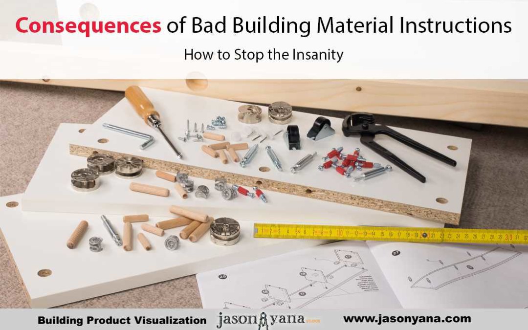
Poor instructions (e.g. too long, too short, skipping steps, making major assumptions about the reason for the fix, etc.) plague the market and plague the consumer.  Sometimes, your customer might even decide to forego your product entirely, if your installation instructions are badly presented, or worse if they don’t even exist.

We all know what happens when instructions are lacking, but that does not stop companies from doing it.  I relate to you an example of frustrating, badly presented installation instructions for replacing the mechanism that locks and unlocks the trunk of a hatchback.

Here is One Such Story, Feel my Pain

I closed the hatchback of my car one day and lo and behold it refused to open the next time I attempted to unlock it.  I tried an endless number of troubleshooting tips, but nothing worked.  Finally, I came to the conclusion that it needed a new trunk mechanism.  I ordered one; it arrived; I was set to go.

The most important step to do in an instruction manual really is the most important step to cover.  And in this experience, my troubles began early.  As I mentioned above, my trunk would NOT open.  But the instruction manual (as well as every online forum I accessed) ASSUMED that the trunk would not close.  And thus “Step 1” simply stated: “Stand at the back of the car.  Pop open the cover inside the trunk to access the mechanism.”

There was just one small problem, the cover is impossible to access when the trunk is closed.  But the instructions said to simply pop it off!  It is irritating when a company assumes that only the easiest thing is wrong.  What good are the instructions then?  I searched and searched online for the instructions for my problem.  But apparently, no one else’s trunk breaks closed, just open.

The steps I needed to do no longer correlated with the “instructions” I had.  I began to invent my own.  This is another negative result of poor instructions: the consumer has to make it up as they go along.  I put the back seat down and crawled into the car to get to the trunk area.  To give you a visual, the car is a Mini Cooper.  I had to work on my side, stretched out, using one arm, a flashlight that was precariously balanced, and no real idea how to open a cover that was supposed to be opened when standing outside the car—when the trunk was open.

I had to work on my side, stretched out, using one arm, a flashlight that was precariously balanced, and no real idea how to open a cover that was supposed to be opened when standing outside the car—when the trunk was open.

I eventually popped/yanked (same difference :)) open the cover and accessed the mechanism.  Next problem: the trunk wouldn’t open save for a few inches because HELLO, it was broken in the locked position—not the open position.

At this point, I just wanted the darn trunk to be open!  So I did what any self-respecting, irritated, bad instruction manual follower would do: I bent, banged, twisted…then bent, and banged some more until it was a mangled piece of metal.  I didn’t care because I had a new one to put on.  After approximately five hours, the trunk was open!  I attached the new mechanism and voila, the trunk closed like gangbusters—no thanks to lousy instructions.

When a company neglects to consider all of the reasons a repair or part change might be needed, consumers feel insulted.  What makes instructions good in the first place is the degree to which they communicate what is happening in the real world.

The entire process is all connected.  If I had had some better instructions, I would have saved myself some hassle.  Better yet, if I had been able to view a more detailed rendering of what this process looked like from my angle, the process would have gone much more smoothly.  My request is not lofty.  It is unlikely that I am the only one whose trunk would mysteriously break from apparently the “wrong” side.

Building Material Install Instructions are Difficult

Installation instructions for building materials can be even more frustrating than my trunk latch.    Chances are some quick conversations with your sales and support staff and some calls to your best customers will result in a nice list of common mistakes people make installing your products.

What if there was a great animated installation video you could have shown them that would have prevented all of those problems?

Would they be more likely to become a repeat customer?

Will you spend less time doing damage control and taking tech calls?

Would your brand image and recognition be elevated?

i think the answer is yes!

Regards,

Jason Yana

About the Author :

Jason Yana has 2 decades of experience in architectural technology, 3d graphics and construction marketing. This unique combination provides highly-effective visual representations of building products that fuel marketing and support efforts.

His award-winning body of work informs, inspires and educates building product customers.

Quit Talking About Yourself to Improve Your Building Material Marketing

Quit Talking About Yourself to Improve Your Building Material Marketing

Just Shut Up

It’s great that your product is the best on the market.   It’s great that you have 400 years of experience selling it.  But shut up about it already.   To truly make a connection with your customers, focus on them.   Don’t be the guy at the cocktail party who won’t stop talking about himself.

To truly make a connection with your customers, focus on them.   Don’t be the guy at the cocktail party who won’t stop talking about himself.

Your customers have many challenges.  Find out what they are and find ways to make their jobs and lives easier.

For example, let’s look at the challenges an architect faces and a few ways we can provide assistance while marketing our products to them at the same time.


Will Choosing This Product Get Me Sued?


Many times over, the architect will have to decide which product to include in a project.  This is a difficult decision.  One which could result in professional suicide if he chooses the wrong product.

Before he even pays attention to things like features, benefits and even cost, the architect is thinking “will using this product get me sued”.

For this reason, your marketing should inspire confidence.   It should demonstrate that you have put the necessary engineering, design and research.

How can your marketing demonstrate all these things and inspire confidence?  What tools can you, the building product marketer, possibly use to make this person believe in your products?


Be An Educator


Use whatever means possible to show your customers how your product works and how they should use it.   Don’t be like the tile manufacturers i saw at the surfaces event in Las Vegas.

I walked through booth after booth of tile manufacturers.   Beautiful ceramic tiles, stone tiles, glass tiles, the whole nine yards.   Do you know how many of these tile manufacturers provide details on how to install tile?   Zero.

It appears to be; pick your tile, pick your quantity and maybe, just maybe they will help you load it into your truck.  After that, you’re on your own kid!

It seems to be up to the companies which make the mortar products, to handle all the installation stuff.   I would think that if one of these tile companies decided to create a series of videos and details showing how to use their tiles to make a shower, or a backsplash, or whatever, they would just have gained a competitive advantage because they are providing a service . . ..  not just a material.     They are adding value to their customers’ lives.


Be a Friend


Consumers are becoming more and more aware of when they are being sold to and when they are being educated.   It is becoming more and more obvious every day that your success is directly related to how many people you can help.

If someone arrives at your web site or gets an email from you and if feels like you really understand their problems and you have a solution, you are more like a friend to them.

So, quit being that guy at the party who won’t stop talking about himself and start listening to your customers problems and start being a good friend to them.

Your Friend,

Jason Yana


About the Author :

Jason Yana has 2 decades of experience in architectural technology, 3d graphics and construction marketing. This unique combination provides highly-effective visual representations of building products that fuel marketing and support efforts.

His award-winning body of work informs, inspires and educates building product customers.

How to Market Your  High-Performance, Green Building Materials

How to Market Your High-Performance, Green Building Materials

Educating the green residential market through visualization

As you well know, building green has been a growing trend for several years now. And that growth is usually associated with commercial construction.

But, it appears, residential construction is catching up. According to a 2015 survey done by Dodge Data & Analytics (DD&A) and the National Association of Home Builders (NAHB), green building now makes up about 30% of the total housing market. Homebuilders expect continued growth as consumers become more educated about green products. And as the demand for green homes increases.

You know your building product is great, and that homebuilders should install it in every home they build. And homebuyers should insist your product be a part of any green home they are thinking of buying.

The builders who already know, like and trust your products know it, too.

So what’s the best way to educate builders and consumers who aren’t yet familiar with you? How can you and your sales reps explain the benefits of your building material? And how it can be a trusted, integral part of their next green home?

Well, if you know me at all, you know what I’ll recommend… But I’ll hold off for a moment, and build my case with three main factors you need to consider…

The challenge you face is marketing to two distinct audiences and determining the best ways to do that.

On the one hand, you need to continue marketing to builders as you always have. But perhaps with a twist (we’ll cover that in a minute…).

On the other hand, you need to market to current and future homeowners. According to the DD&A / NAHB report noted above, the most green-savvy homeowners are age 55 and older. This group has the most homeownership experience right now. But it’s equally important to meet the other demographics, including the millennials, where they are as well.

As the younger, more environmentally-conscious millennials gain home buying experience and knowledge, their demand for high-performing homes will increase.

And that’s where you need to focus your marketing efforts. Educating all of your audiences on energy performance and clearly showing where your product fits into that story. Whether your product is hempcrete, solar panels or durable exterior finishes, your product has a place in the big picture. Your marketing’s #1 job should be to clarify the deep benefits your product will provide to your prospects.

Selling to homeowners…

When you educate homeowners, it’s critical to look at how your marketing can connect their emotions with your product. They don’t make the decision on a majority of the products going into their home. But they will usually have to pay a premium for a green home.

Educating homebuyers ahead of time on the benefits of a home featuring your product, increases demand for your product. Increasing the number of builders looking for your product on their next green homes.

Are you clearly showing and explaining how your product helps make their home more healthy, safe and durable?

Are you illustrating how your building product protects them from any real or perceived pains or hassles their family might be facing, or worry about facing?

In a previous blog post, you can begin to see how visualizations can help you do just that.

Building Systems Explained

Selling to builders…

To sell to homebuilders, focus on their biggest problems and make sure your product helps solve them. For most builders their focus is selling more homes and maintaining good profit margins.

Mark Mitchell, a top marketer helping building material manufacturers, points to some of the key things you should focus on in one of his past blog posts. A builder wants:

  1. Solutions to their problems
  2. Knowledge – they want to be educated about your product
  3. Competitive (not lowest) price – if there is a premium for your green product, they want assurance that it is a fair price
  4. Relationship – they want to know you have a local supplier that can be available for delivery and support

So do your homework and make sure you know the homebuilders you’re marketing to. What are the frustrations they’re dealing with? How can you help them sell the benefits of your product? How can your green product help them sell more homes?

You can’t expect them to make the leap. You need to connect the dots as clearly and quickly as possible in your marketing materials.

Help them “find the money” if your product involves a trade up from their usual product. Help them see how your product will help them differentiate themselves and their homes from other builders in their area. Show how your product can make their job go faster or with fewer headaches.

Key features of green products…

The final factor to consider for marketing your green building products is what consumers and builders consider the most important features.

These will change over time, according to trends, but in the DD&A / NAHB report, the most important features of green products are:

  • Energy efficiency
  • Durability & resilience
  • How they contribute to a healthier indoor living environment

If done properly, your marketing can do a lot of the work to help clarify and illustrate how your product meets these required features. The key will be to stay on top of the current trends and keeping your finger on the pulse of the market.

Transparency is becoming more and more important to the building industry. It’s no longer enough to just say your product is “healthy” and good for the environment. You need to provide the backup and the proof. Certifications, as well as providing environmental product declarations and health product declarations, are key pieces of proof to provide.

But more importantly, is making sure your backup is easy to understand. As already mentioned –

Don’t expect them to make the leap! Be the bridge that helps them quickly and easily see how your product fits into their project, and how it solves, at least, one of their problems.

Pulling it all together…

Many building products that help make a home more comfortable, healthy and green are “hidden.” They’re buried in the walls, under the floors or above the ceilings. You can say the same for the benefits your product provides. Those benefits may not be easily seen or explained.

If your product needs help being brought into the light… If you need help clarifying the benefits of your green products to your prospects and clients… Consider how visualizations could help you tell those stories.

Look through the site and see how they’ve helped other great companies like yours tell their stories.

Or you can contact me today, and we can discuss how to get started on your project.

About the Author :

Jason Yana has 2 decades of experience in architectural technology, 3d graphics and construction marketing. This unique combination provides highly-effective visual representations of building products that fuel marketing and support efforts.

His award-winning body of work informs, inspires and educates building product customers.