5 Reasons Why Visuals are More Important Than Words Alone For Marketing Building Materials

5 Reasons Why Visuals are More Important Than Words Alone For Marketing Building Materials

There Really is No Substitute For Experiencing Something Firsthand

Imagine, for a moment, that you are watching an old DVD of the movie, “Troy”. Boagrius, a huge, sweaty giant of a man, is standing with a sword and the crowd is yelling for Achilles to come out and fight him. Brad Pitt has buffed up for the role, but it’s obvious that his Achilles is still no match for this leviathan. You figure Achilles is toast. Achilles comes out with a dagger in his hand, then he starts running. He dodges two swords and throws down his shield. He runs and runs, and flies through the air, jabbing that knife into the neck of Boagrius as he flies past him. Boagrius is finished.

You’ve read the description, but it’s still no match for seeing the action, which lasted a mere fraction of the time it took to read about. You have a good imagination, but the impact is not the same.

Statistics Prove The Power of Visuals

This is just one of the reasons why visuals are more important than words alone. Beyond the short attention span so rampant today, there are actual physiological reasons why images have a powerful and staying power in the human brain. In today’s internet universe, video is king. Here are a few statistics:

  1. According to 3M Corporation and Zabisco, visuals are processed 60,000 times faster in the brain than text.
  2. SEOmoz has found that posts with videos attract 3 times more inbound links than plain text posts.
  3. 85% of the US internet audience watches videos online. Nielson says that the 25-34 age group watches the most online videos, and adult males spend 40% more time watching videos on the internet than females.
  4. Over 300 hours of videos are uploaded each minute on YouTube.com.
  5. Internet Retailer states viewers are 85% more likely to purchase a product after watching a video.

But there is more. According to author and communicator Bryan Paul Kelly, “Most things such as books or even PowerPoint slides filled with bullets are hard to recall… The words of even the most stirring and inspiring speech are difficult to remember.”

As Kelly points out, “The brain craves visuals.” Videos stir emotions, and long-term memory depends on emotions. That alone may be enough reason to use the many visual tools available to us. In the competitive world of the internet, anything with staying power is gold.

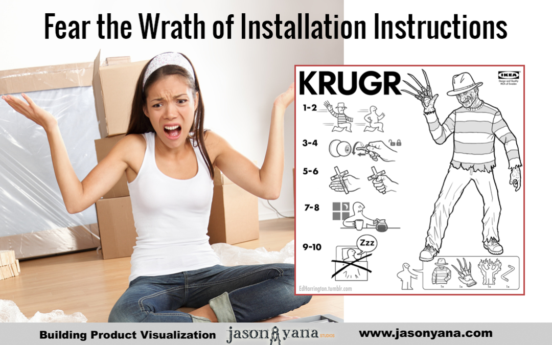
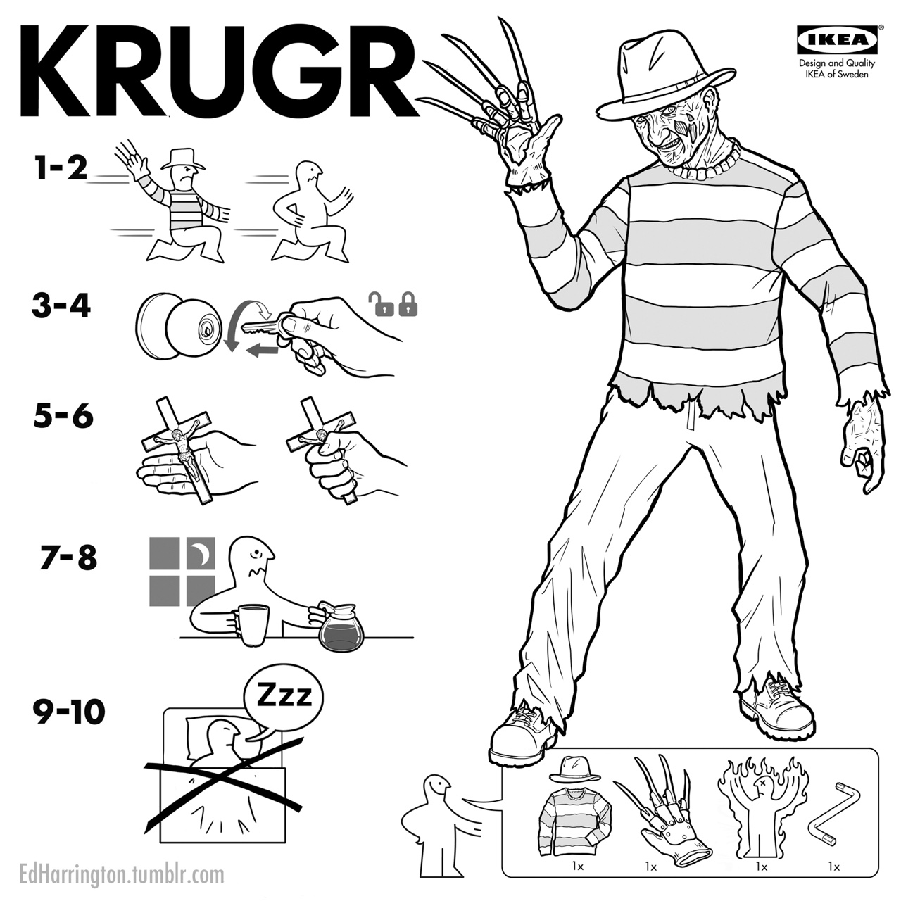
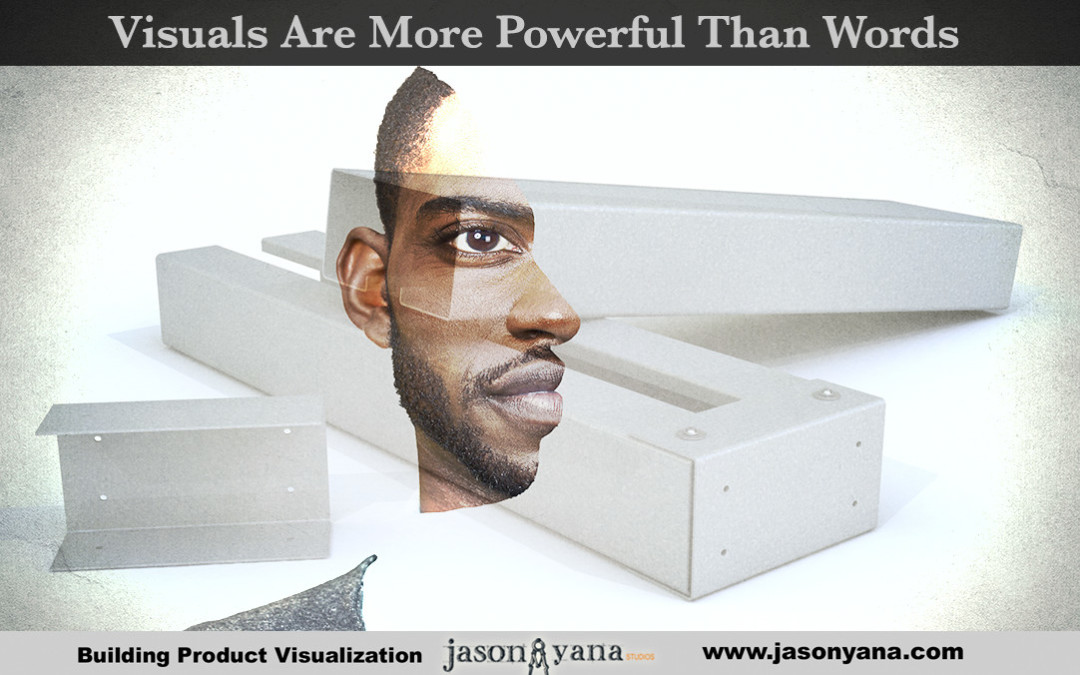
This holds true for building materials, especially those which are sold on the basis of how they are installed, how they work, or some other aspect which requires experiencing the action to fully grasp.  Make your product come alive and be the Brad Pitt in your action movie like the example below.

Let Your Potential Customers Experience Your Building Materials

Regards and I hope you find beauty today, even when it isn’t pretty,

-JY


About the Author :

Jason Yana has 2 decades of experience in architectural technology, 3d graphics and construction marketing. This unique combination provides highly-effective visual representations of building products that fuel marketing and support efforts.

His award-winning body of work informs, inspires and educates building product customers.

Don’t Let Your Building Materials Fail Like These 5 Ugly Examples

Don’t Let Your Building Materials Fail Like These 5 Ugly Examples

Design Matters: 5 Examples of Great Products that Failed Because They Were Just Too Ugly

Human beings are visual creatures. We crave visual input, and more than that, we want input that we deem pleasing. With most products, design centers on the idea of aesthetics; the science of the appreciation of beauty.  This is not always the case with building materials, especially those which are “behind the wall” products which will not be seen once the project is completed.

Now, while it is true that beauty is in the eye of the beholder, there is a lot more to the human experience than each person’s individual tastes. Psychology tells us about a type of cognitive bias called the ‘Halo Effect’, which is a concept wherein your initial impression of someone affects your evaluation of that person.

The Halo Effect applies to more than just person-to-person interactions, though, and can determine our preconceived notions about objects as well. Simply put, if you like one aspect of a particular thing, you will gain an overall positive view of that thing. If you dislike one aspect of a thing, then you will have an overall negative view of it.

So what does the Halo Effect have to do with how your present your building materials? Glad you asked. According to the psychology of this effect, if you see a product that you think is downright ugly, you will have a negative bias towards that product. Not quite sure you believe me? Take a look at these 5 examples of great products that failed because they were just too ugly.  These examples are various consumer products which do not have to be beautiful to do their job, but they failed because they were not visually appealing, don’t let your building materials suffer this same fate.

Ford Edsel

"1958 Corsair Daten" by Michael Kistinger - http://www.edsel.kistinger.com. Licensed under CC BY-SA 3.0 via Commons - https://commons.wikimedia.org/wiki/File:1958_Corsair_Daten.jpg#/media/File:1958_Corsair_Daten.jpg

“1958 Corsair Daten” by Michael Kistinger

This monstrosity released in 1957 has one of the worst records of all time in the automobile industry. The car itself was not that bad, but the design seriously turned people off. You could hardly fit the car in a parking space, for one, and secondly the front grill looked nearly like a toilet seat affixed to the engine compartment.


Pontiac Aztek

Pontiac Aztek

One look at the style of the Aztek and it is easy to see why it became the top car on nearly all of the “Worst Cars in History” and “Ugliest Cars Ever” lists. This car looked like the manufacturer threw together spare parts and called it a crossover. In a practical sense, nothing was wrong with the car, so it is nearly unbelievable that something so unsightly came from the same mind that would later design the Chevrolet Corvette C7.

Oakley Thump Sunglasses

Oakley Thump Glasses

Oakley Thump Glasses

Imagine sitting at the beach with your shades on, listening to your favorite music and needing no external devices. Sounds nice right? That was the promise of Oakley’s Thump sunglasses, which combined the utility of sunglasses with an MP3 player. Oakley simply forgot to make them nice enough that any self-respecting person would actually wear them.

Heinz EZ Squirt Ketchup

EZ Squirt

EZ Squirt

If children were in charge of picking the condiments to buy, Heinz may have been on the right track. The problem with EZ Squirt Ketchup was the color palette. Garish, bright hues that only look more like a practical joke than an edible food made this perfectly fine topping bottom out.

The Segway

The stylish segway

The stylish segway

One of the most hyped up modes of transportation of all time instantly became one of the most ridiculed. The Segway quickly went from novelty to gimmick, and became the transportation equivalent of what a fanny pack does for fashion. Touted as sleek and functional, the Segway is now only a joke as the premiere ride for Mall Cops.


Remember these otherwise well thought out products when you are presenting your building materials and building products to the world.  If architects find them ugly, they won’t spend the time to understand all the positive features and benefits of the products.

Regards, and I hope you find beauty today, even when it isn’t pretty.

-JY

3 Horror Stories of Bad Installation Instructions – Save Your Building Material Customers!

3 Horror Stories of Bad Installation Instructions – Save Your Building Material Customers!

We have all had a bad experience trying to assemble that new flat-packed piece of furniture we just purchased.  The directions show the pieces effortlessly flying together, but it isn’t even clear which side of board H is which or how exactly to hold part A247 close enough to part Q72 so screw #27 can engage wing nut #AAA2.

To be stumped by instructions at some point has almost become an essential part of the human experience, and stories about frustrating, badly presented installation or setup instructions are now ubiquitous.  We had some fun bringing a few of those stories here, just to put it into perspective for you in the hopes that you save your building materials customers from this sort of frustration.

Story 1: Barbie’s House of Horrors

barbiehouse

(This really is the install instruction sheet)

You would think that in the age of 140 character limits, something would carry over to the world of instruction manuals.  Au contraire, the manuals remain as bad as they ever have been; case in point the Barbie Dream House.  You can find no shortage of horror stories on google of parents struggling to get this pink mansion built.  The reason?  The instructions feature vague, over-packed and unlabeled picture portions for one.   Secondly, the text is reduced to an illegible state due to the amount squeezed on a page.  These features go hand-in-hand to make Barbie’s home the last thing on a parent’s Christmas shopping list.

Story 2: The Domestic Disturbance

Illustrator and cartoonist Ed Harrington has created a funny collection of IKEA-style assembly instructions that show how to make iconic movie monsters.

Illustrator and cartoonist Ed Harrington has created a funny collection of IKEA-style assembly instructions that show how to make iconic movie monsters.

In 2013, the Huffington Post ran an interesting story.  A concerned neighbor living in Stromstad, Sweden called the police to report loud “banging” and “crying” coming from the house next door.  When authorities arrived, they discovered that the banging emanated from the attempts of a couple to figure out instructions for and assemble a piece of IKEA furniture. Meanwhile, the crying was their baby who had just had enough of the noise.

Story 3: The Dresser of Broken Dreams


 One thing many sets of instructions do is leave important notes out.  Take the example that the commenter “deedee914” on this post.  She was working to build a new dresser according to the instructions that came from IKEA, but they left out the fact that the dresser tends to fall over easily, leading to a broken hand for deedee914.  The website did mention this little tidbit of information, but you would hope you would not have to go searching for that kind of information.

Don’t Make the Same Mistake for Your Building Materials Installation Instructions

So, as building product and building materials marketers, we are not selling furniture or barbie houses,  the stakes are far higher for us.   Poorly presented installation instructions will result in more than frustration and lost sales.  If our products are not installed correctly, buildings will fail and lawsuits will follow.

I hope you enjoyed these fun stories and I hope you find beauty today, even when it’s not pretty.

Regards,

-JY

About the Author :

Jason Yana has 2 decades of experience in architectural technology, 3d graphics and construction marketing. This unique combination provides highly-effective visual representations of building products that fuel marketing and support efforts.

His award-winning body of work informs, inspires and educates building product customers.

Sell and Refine  New Building Products Before You Manufacture Them.  Lessons Learned From Kickstarter

Sell and Refine New Building Products Before You Manufacture Them. Lessons Learned From Kickstarter

Build It and Maybe They Will Like It.

The traditional methodology for inventing, designing, and selling a new product is dead.  There is something to be learned from the silicon-valley inspired crowdsourcing put on by sites like kickstarter or indiegogo.   Essentially what is happening here is people are selling products before they are even built.

The Old-School Way of Inventing New Products

Traditionally, you dream up a new widget which solves a problem.   It might be a stronger and lighter cladding or a new labor-saving metal stud which installs in less time.   Regardless of what it is, the next step is to sketch it, design it, manufacture it, test it and then ultimately market and sell it.   It is not until you have spent a fortune in time and money that you find out if it will be a success or a failure.

The Modern Way of Inventing New Products

The online-tech world has a different way now, a leaner and smarter way.  You design the product, focusing not on how it will actually work, but on the problem it will solve and what it will mean to the customer.   You make a great video, throw it up on kickstarter and if the idea resonates with people, they will put money in up-front to get your widget.   If enough people do this, you meet your goal and you now have the money to actually make the thing.


I’m not suggesting that building products should be created this way, but maybe there is a lesson to be learned here.   

[convertkit]

Have a Virtual Version of Your Invention Made First

What if you took your latest and greatest idea and created a video which used photorealistic 3d animation to demonstrate what the product is, how it works and why someone should use it in a 3 minute video? That is exactly what a few forward-thinking bpm’s have been doing for years.

You then pass that video up and down your organization, or to an industry partner or investor.  If everyone agrees on the potential of the widget, you then use the video to put the idea in front of your potential customers and then gauge their interest.   

If they show a high enough level of interest, then you go ahead and manufacture the widget without the risk of it being a complete failure in the market.

You Will Improve Your Invention Before Building It

An unintended consequence of this methodology has often been the refinement of the product design at a far earlier stage.  Typically, when someone hands me a new product design, I will make my 3d model of it, but I will also model it in-context so we can show how it is installed, where it is installed and why.   In that process, if there is an inherent design flaw in the product, we will find it far before the thing is mass produced, or even before it exists in the physical world at all.   

For Example

For example, when you watch this video below, think about how this could have been created long before this product was ever actually manufactured (it wasn’t –  but I thought it would make for good food for thought).   Consider the possible implications of that in the way your organization invents new products.

Regards and I hope you find beauty today, even when it does not yet exist.

-JY

About the Author :

Jason Yana has 2 decades of experience in architectural technology, 3d graphics and construction marketing. This unique combination provides highly-effective visual representations of building products that fuel marketing and support efforts.

His award-winning body of work informs, inspires and educates building product customers.

Understand How Architects See the World to Sell More Building Materials

Understand How Architects See the World to Sell More Building Materials

During my time getting my architecture degree in college, I realized pretty quickly that not many people saw things quite the same way.  I have always wanted to see and understand how every little connector, part and component go together and was excited to see that many great architects of the past and present felt the same.   While most were interested in the final product of architecture – the outward appearance of the finished project – I was equally interested in all the things you never see once a building is completed.  All the materials, products, connectors, etc. are as beautiful to me as any stainless steel appliance, granite countertop or other decorative design element.

Architects tend to have 2 streams of consciousness running simultaneously

This is the way most of the architects you will encounter look at the world.  They look at everything, they see everything and they tend to maintain two tracks of consciousness :

  1. The way the world is
  2. The way the world could be

It is like there is a sub-title track at the bottom of their movie, constantly trying to bridge the gap between what is, and what could be.

Help them bridge the gap

Visually, this means show them how you product makes the world better.   Demonstrate your love for your products by making them look beautiful.   Explain how your product keeps that wall from deteriorating (thus becoming ugly)  by helping water drain out.  Share the root passion of how and why your product makes the world a more beautiful place.  


Regards and I hope you find beauty today, even when it is not pretty.

-JY

About the Author :

Jason Yana has 2 decades of experience in architectural technology, 3d graphics and construction marketing. This unique combination provides highly-effective visual representations of building products that fuel marketing and support efforts.

His award-winning body of work informs, inspires and educates building product customers.

Study: Demand for Visual Content in Marketing on The Rise

Study: Demand for Visual Content in Marketing on The Rise

With the multitude of information being blasted at marketing managers for building product companies, it is easy to get overwhelmed.   We tend to get sucked into doing things the way we have always done them, creating glossy printed brochures or coming up with the latest hashtag to drive web traffic.

When this happens, it is helpful to step back and get inside the head of your target customers, put yourself in their shoes and have a new look at your building product brand from the outside in.   A helpful way to do this is to have a look at the research that is out there, and see what other marketing managers are thinking.

In a recent study “From Creativity to Content” was a survey of 177 senior marketers in North America.  The results strongly show that visual assets are all increasing in importance.   This is especially important to us, most of which are creating marketing efforts directed towards Architects, who are decidedly visual people.


importance-chart

chart


Sometimes it is easy to forget the simple things, using dramatic visuals to tell the story of a brand is really the quickest way to communicate with another human being.   A large percentage of our brains are dedicated to visual processing, and the first impression your brand makes is critical.

Regards and I hope you find beauty today, even when it is not pretty.


-JY


About the Author :

Jason Yana has 2 decades of experience in architectural technology, 3d graphics and construction marketing. This unique combination provides highly-effective visual representations of building products that fuel marketing and support efforts.

His award-winning body of work informs, inspires and educates building product customers.