Start “scaling-up” your marketing with product renderings and animations
Ask a building product marketer about their advertising. They’ll usually picture an ad in a trade journal’s printed or digital magazine. They’re hoping to catch their prospect’s eye while flipping through pages to get to the next feature article.
It’s an expensive way to get customers. Think of the money you pay to make it happen:
- Photography – You’ve got the photographer’s time, any models, studio time rental, and your own staff’s time.
- Copy – You have the cost of a professional copywriter to get the words right.
- Design – You’ll need a graphic designer to assemble the copy and images to look great for the final layout.
- Ad space cost – Depending on the trade journal, for a ½-page ad, you’ll pay $3,000 to $11,000 per ad.
- Ad agency – If you hired an ad agency to help put all these pieces together – Guess what? They get paid, too.
And that’s all for a single ad. You might run the same ad several times, but you’ll pay the ad space cost each time. It adds up fast.
So why do some companies go with this as their knee-jerk reaction to marketing their products and leave it at that?
It’s not their fault. It’s just how a lot of marketers were programmed to think… “Let’s get our brand in front of as many eyeballs as we can and we’re golden…”
But I’ll bet you’re better than that. Read on for some ideas to help you expand and scale your advertising efforts.
The most important question you must ask
The very bottom line of any marketing action you take – online or offline – is you have to answer “Yes” to the following question:
“Does it advance the making of the sale?”
This is paraphrased from direct response marketing legend, Dan Kennedy. He was talking about when to use humor in a sales presentation. But it’s a simple question you can and should use to stop throwing your budget into the marketing money pit.
Before you run another ad, put it to this test. Does it have the elements to move your ideal prospects in the right direction toward buying or specifying your product?
You’ve surely been in a conversation about a clever or funny Super Bowl ad, but nobody remembers what product the ad was selling.
This is a prime example of an ad that doesn’t pass the test. It’s not moving anybody toward the sale of anything. (And that company paid a LOT more for the TV ad than your trade journal ad costs…)
So, if you’re game, let’s use this question to…
Scale-up your marketing
My goal isn’t to convince you to quit advertising in trade journals. Quite the opposite. I’m showing you how you can do it better.
In another post, we talked about how you can leverage high-quality images and video to synergize your marketing efforts. If you haven’t read that one and seen the examples of how some of my clients are doing it right, go ahead and read it.
I’ll wait for you…
…You’re back? Good. I hope those examples gave you some ideas for your marketing.
Now let’s look at how you can use those images and videos to scale up your other marketing efforts. Specifically, how you can combine the power of high-quality product renderings and animations to supercharge your offline advertising.
The perilous path of offline-to-online…
In most cases, your ultimate goal for your magazine ads should be to give your prospect a compelling reason to go from the magazine to your website. Or your social media pages. Or to send you an email. That’s what I’m calling offline-to-online.
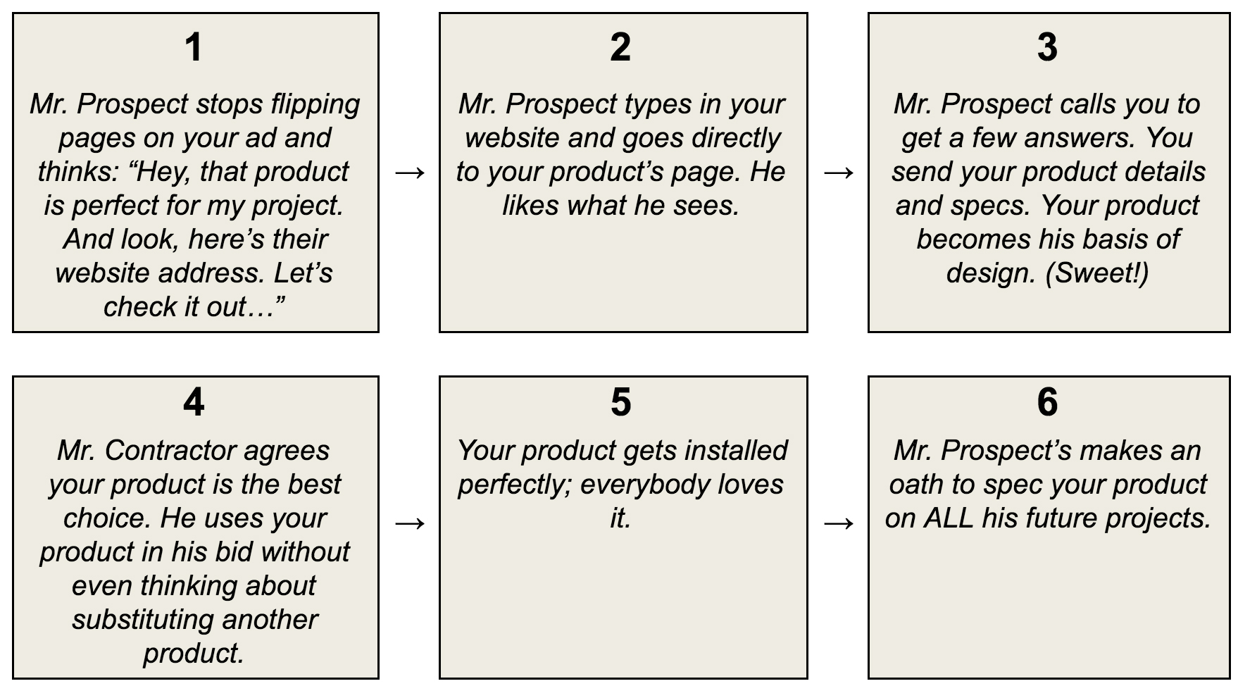
Let’s say you drew a simple cartoon strip of the ideal progression from your prospect (an architect for our example) finding your building product ad in a magazine. It might go something like this:

But we both know about 1,001 things could go wrong on that path.
He might…
- Get sidetracked between seeing your ad and typing in your web address…
- Get distracted by something else on your site and never come back to the original product he was looking for…
- Forget to include your product in his specifications…
- Let the contractor substitute an inferior product without a fight…
- Have to deal with an installer screw-up and blame the product…
- Or 996 other little distractions or bumps in the road…
We can’t cover all 1,001 fixes in this post. But we can look at how you can create better ads to create a “greased slide” to get him from Step 1 to 6 as smoothly as possible?
Creating ads that work for you…
Flip through any trade journal and you still see so many companies missing the mark of an effective ad.
Most ads won’t get a prospect engaged enough to make it through the “gauntlet of distractions” to even reach Step 2 or 3 of your comic strip above.
Most ads have an eye-catching image of some kind, along with the company or product name taking up most of the ad space. But you’ll usually get lost figuring out what the image has to do with their product. And how it can benefit you.
Then, if you’re lucky, the ad includes a web address. But guess where it takes you?
The company’s home page. And that home page is full of distractions to lead you astray.
So how can you make your ad better than the rest? Let’s start with that image…
If you’ve been reading any of my other posts, or are at all familiar with my work, you should already have some ideas on how to improve the image.
Don’t just throw up a pretty picture of a completed building and hope your prospect can figure out what role your product played. You need to help them bridge the gap with an image that makes it crystal clear how your product will help make their building a success.
With more effective images, you’ll not only grab your prospect’s attention. You’ll also tell him so much more about your product through these visuals.
Keep moving forward…
Now let’s look at the copy in your ad. This is where you need to give your prospect a reason to take that next step. To get him to make the leap from offline-to-online, you need to offer something he wants.
That’s where your product animations can come in. He’s seen the image of your product. He’s beginning to see how it could help his project.
The next logical step in convincing him could be a video demonstrating your product in action. Tell him why he’ll want to take that next step.
Use your limited copy to help him see how your product’s benefits are a good fit. Then let him know where he can see more…
This is where so many ads go wrong…
Don’t give him a web address that sends him to your home page. Hoping he finds your video. He will get lost or confused. (Remember we’re creating a greased slide.)
Give him a custom URL that takes him directly to that video. No other stops along the way. No distractions.
If you’ve got a video at that URL that helps him fill in the gaps, you’re well on your way to leading him through the path to specifying your product.
What you should do next
Today, you’ve seen how most magazine and trade journal ads are not nearly as effective as they could be. You also learned the crucial question you should ask of every step you’re taking in your marketing strategy.
You also saw a few simple adjustments you can make to your ads. Tweaks to help guide your prospects down the path to knowing, liking and trusting you and your product.
So what do you think? Does all that sound do-able? It really is a few simple tweaks that can make a huge difference.
As always, if there’s anything you need help with in the way of high-quality visualizations — let’s talk. We can get you set up with installation animations and 3D renderings to help scale up all of your marketing efforts.
About the Author :
Jason Yana has 2 decades of experience in architectural technology, 3d graphics and construction marketing. This unique combination provides highly-effective visual representations of building products that fuel marketing and support efforts.
His award-winning body of work informs, inspires and educates building product customers.

