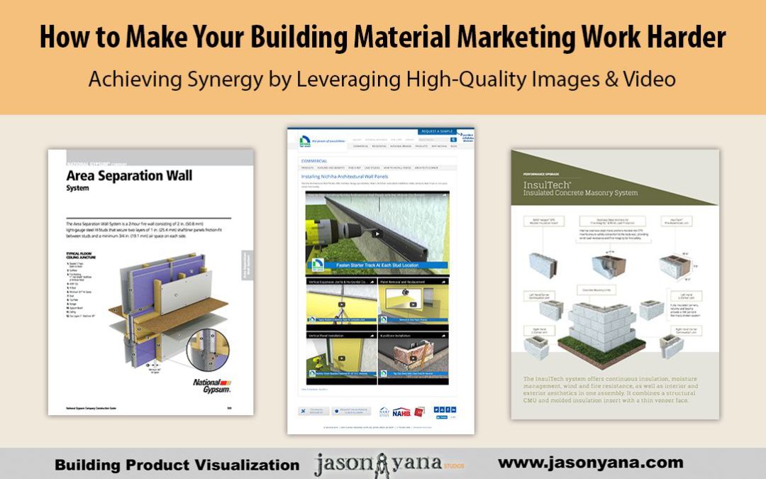
Achieving Synergy by Leveraging High-Quality Videos & 3d Renderings
Before we get started, let me just say…
It was hard NOT using the word “synergy” in the title of this post. It’s one of those corporate-sounding throwaway buzzwords that’s been done to death. Which sucks – because it does a good job summarizing what we’re talking about today.
Synergy in your marketing is two or more initiatives working together to create a response greater than the sum of the elements alone. That’s according to a definition I found at smallbusiness.chron.com.
With traditional marketing methods, you end up paying twice for a marketing piece – once for its design and production, and again for the placement in the media of your choice (magazine, radio, trade journal). But you only get a single return from each effort.
However, done right, your marketing today can be paid for just once, but continue to provide you with returns virtually forever. That’s especially useful if your company has a limited marketing budget…
“Big doors swing on little hinges.” – W. Clement Stone
So how does this all apply to high-quality visualizations?
When you invest a portion of your marketing dollars on a few well-considered visual pieces – details, animations and 3-D renderings of your product – you create synergies between your sales & marketing materials and your technical documents.
What that means is you’re…
- Making your marketing materials more technical, but still aesthetically pleasing…
- Creating engaging and attention-grabbing technical pieces that are marketing-oriented…
- Adding “why statements” to your technical pieces to get in front of your prospects questions
To give you a better idea of what we’re talking about here, let’s take a look at how some of the larger building product companies have been successfully using videos and renderings in an expanding way.
Nichiha
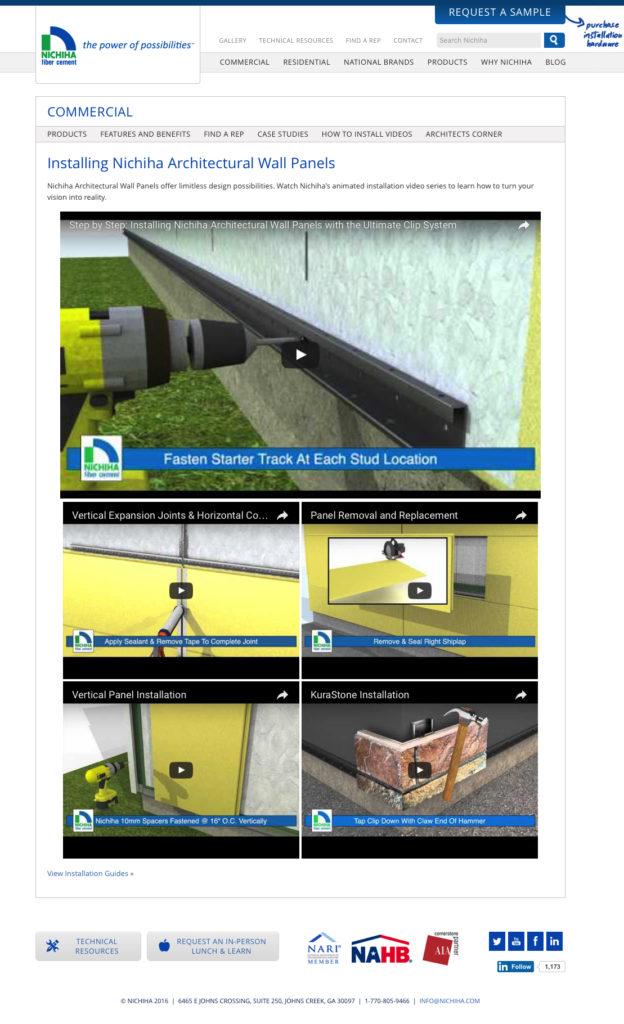
Nichiha, the fiber cement product manufacturer, does a great job of re-purposing their visualization throughout their marketing, sales and technical documents.
Not only are they using animated installation videos on their website to demonstrate the installation of their product lines to architects and contractors…
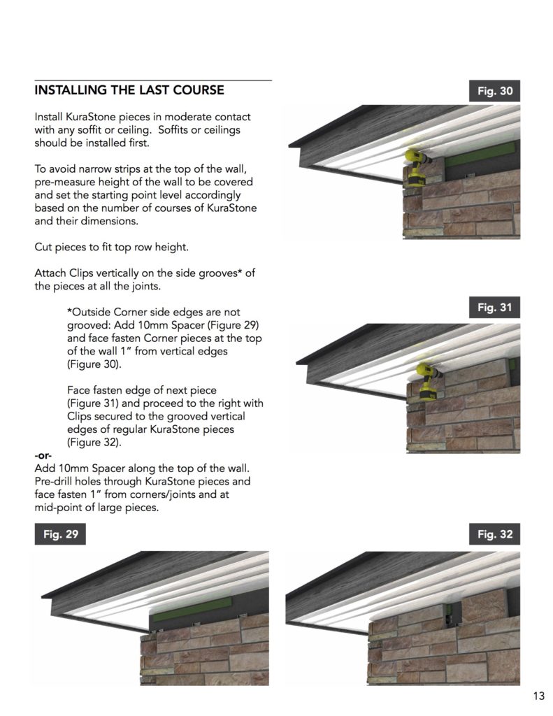
…They’re also combining video screen shots with photographs and 2D details in their installation instructions to clearly demonstrate to installers every step needed to provide a great project…
…You’ll also find their pulling 3D renderings into their brochures and other sales documents and weaving them between their sales copy and beautiful project photos.
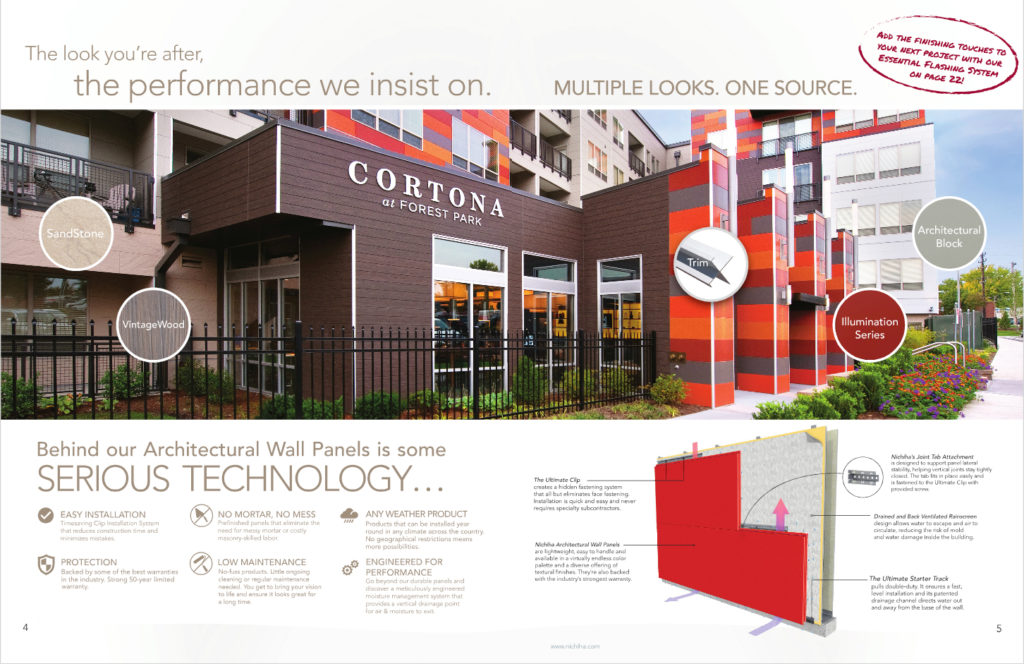
It’s through this synergy that they effectively & successfully demonstrate how their products can work as part of the architects next project… While also creating a consistency that runs through all of their forms of communication with their clients and installers.
Oldcastle – Echelon Insultech
Let’s look at another great example: Oldcastle’s Echelon masonry product – Insultech.
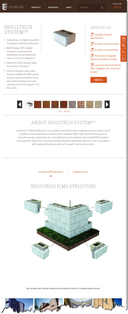
For their Insultech product line, since it is one of those “behind-the-scenes” products, project photos don’t do it justice. That’s why it’s critical that they use a variety of images to demonstrate the product’s features and benefits to their clients.
It all starts on the website’s product page, where they use a variety of 3D rendering and details to illustrate the product…
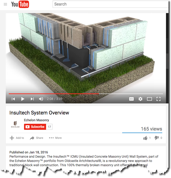
If you happen to check out their YouTube channel, you’ll find they use a combination of live product demonstrations with 3D renderings and CAD drawings to properly demonstrate their products value.
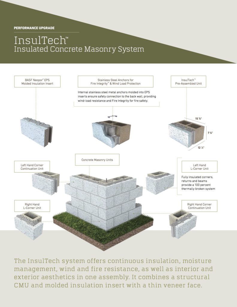
In their Masonry Performance Upgrade catalog, their also using similar version of these 3D rendering to explain each of their upgrade options. And, again, we see they’re weaving the images together with sales copy, project photos and technical drawings.
Throughout their marketing and technical documents, Echelon is doing a great job of utilizing the many small pieces they’ve collected and are using them effectively across their website, their leave-behinds, and the rest of their media sources.
National Gypsum
For today’s last example, I’m highlighting the work that National Gypsum is doing. They’ve spent a lot of time and effort developing a library of product drawing, details, and animations to clarify their product lines.
(…By the way, I just finished putting together a case study of the work we’ve done together, so if you’d like to learn more, send me a quick message and I’ll email you the PDF…)
National Gypsum’s most comprehensive incorporation of the many small pieces and parts that they’ve generated and collected are brought together in their newly-released (circa June 2016) “NGC Construction Guide.”
Throughout the almost 400-page guide, they’ve brought together all of the technical details, renderings and images to clarify their extensive product lines. I’m honored to have been part of the development of the visualization pieces. Here are a few pages from the guide…
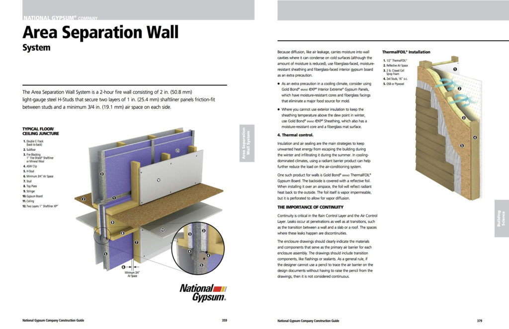
As an architect or contractor goes through the National Gypsum website, or any of the other marketing channels NGC uses, they’ll see a consistent use of the many visual pieces they’ve developed over time.
It’s through this consistency, that National Gypsum has developed an effective strategy to communicate the value their products provide, and how their clients can use those products to create the best project possible.
Conclusion
As you can see, investing in a few high-quality product renderings or videos to weave throughout your marketing and customer service strategies can be scaled as much or as little as you want.
Your strategies can adjust as your marketing budgets fluctuate. But each of these pieces can be repurposed throughout all of your communications with your client. The options are unlimited.
So get started building your library today.

