Design Matters: 5 Examples of Great Products that Failed Because They Were Just Too Ugly
Human beings are visual creatures. We crave visual input, and more than that, we want input that we deem pleasing. With most products, design centers on the idea of aesthetics; the science of the appreciation of beauty. This is not always the case with building materials, especially those which are “behind the wall” products which will not be seen once the project is completed.
Now, while it is true that beauty is in the eye of the beholder, there is a lot more to the human experience than each person’s individual tastes. Psychology tells us about a type of cognitive bias called the ‘Halo Effect’, which is a concept wherein your initial impression of someone affects your evaluation of that person.
The Halo Effect applies to more than just person-to-person interactions, though, and can determine our preconceived notions about objects as well. Simply put, if you like one aspect of a particular thing, you will gain an overall positive view of that thing. If you dislike one aspect of a thing, then you will have an overall negative view of it.
So what does the Halo Effect have to do with how your present your building materials? Glad you asked. According to the psychology of this effect, if you see a product that you think is downright ugly, you will have a negative bias towards that product. Not quite sure you believe me? Take a look at these 5 examples of great products that failed because they were just too ugly. These examples are various consumer products which do not have to be beautiful to do their job, but they failed because they were not visually appealing, don’t let your building materials suffer this same fate.
Ford Edsel
This monstrosity released in 1957 has one of the worst records of all time in the automobile industry. The car itself was not that bad, but the design seriously turned people off. You could hardly fit the car in a parking space, for one, and secondly the front grill looked nearly like a toilet seat affixed to the engine compartment.
Pontiac Aztek
One look at the style of the Aztek and it is easy to see why it became the top car on nearly all of the “Worst Cars in History” and “Ugliest Cars Ever” lists. This car looked like the manufacturer threw together spare parts and called it a crossover. In a practical sense, nothing was wrong with the car, so it is nearly unbelievable that something so unsightly came from the same mind that would later design the Chevrolet Corvette C7.
Oakley Thump Sunglasses
Imagine sitting at the beach with your shades on, listening to your favorite music and needing no external devices. Sounds nice right? That was the promise of Oakley’s Thump sunglasses, which combined the utility of sunglasses with an MP3 player. Oakley simply forgot to make them nice enough that any self-respecting person would actually wear them.
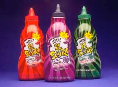
Heinz EZ Squirt Ketchup
The Segway
One of the most hyped up modes of transportation of all time instantly became one of the most ridiculed. The Segway quickly went from novelty to gimmick, and became the transportation equivalent of what a fanny pack does for fashion. Touted as sleek and functional, the Segway is now only a joke as the premiere ride for Mall Cops.
Remember these otherwise well thought out products when you are presenting your building materials and building products to the world. If architects find them ugly, they won’t spend the time to understand all the positive features and benefits of the products.
Regards, and I hope you find beauty today, even when it isn’t pretty.
-JY

