Why Building Material Companies Cannot Ignore Design-Build

Why Building Material Companies Cannot Ignore Design-Build
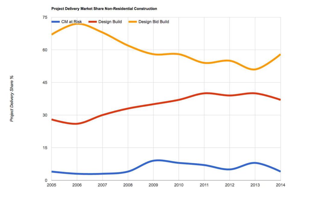
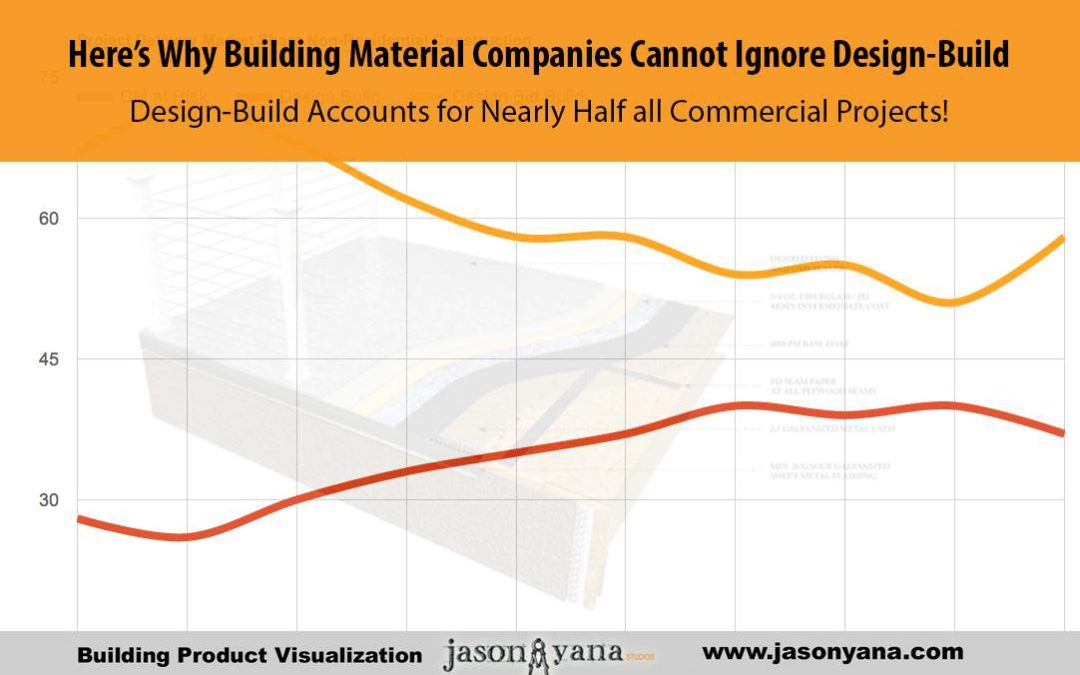
Did you know that — on average — design-build project account for almost 40% of non-residential design and construction that’s going up around the country? In some states, like Oregon & Hawaii, it’s up around 68%… for military work, it’s over 80%.
Design Build for Manufacturers

That’s what the most recent RS Means Design-Build Project Delivery Market Share and Market Size Report says.

I know I was surprised when I heard it.

That’s a pretty huge deal… and a huge opportunity for building product manufacturers. Assuming you can figure out how to get your products into that market.

In this post, I’d like to share a few ideas on how you can do just that.

Entering the Design-Build world

In his blog post about the growing design-build market, Mark Mitchell says:

“…In the world of design-build, the more knowledgeable the contractor is about your products’ quality, what your products can do, how fast you can supply them, what they cost, and how flexible you are to work with, the more likely you will be called on to be part of the team.”

As usual, Mark’s advice is right on the money. But there are also other possible entry points to consider. Such as through an architect who is part of the design-build team. Or through a developer. Or all the above.

There are several design-build contractual arrangements you’ll come across. So you’ll want to consider different approaches for your product. In the end, it’s up to you to determine and test the strategy or strategies that will be most effective for your specific products and services.

To get a general idea of the lay of the land, let’s take a look at some of the basic delivery methods you might come across as you look for a way to get started…

Understanding Design-Build delivery methods

The following list covers the most common design-build delivery methods you’ll run into as defined by the Design-Build Institute of America. I’m listing these so you’ll understand the possible “pecking-order” you might be dealing with. I won’t go into the pros and cons of each method.

Just know these variations exist, and different approaches may be required for each…

  • Joint Venture: A joint venture between a designer and a builder.

  • Fully Integrated: A design-build organization with in-house design and construction capabilities.

  • Contractor-Led: A construction contractor as the prime contracting entity with the architect/engineer as a consultant to the contractor.

  • Designer-Led: A design professional as the prime contracting entity with a construction contractor as subcontractor.

  • Developer-Led: The design-build entity is led by a developer with the construction contractor and design professionals both as sub-contractors.

So, now you have a general picture of who the players are. For any successful design-build team, the key to success is an environment that encourages collaboration and open communication within the team and with the owner.

This is where your marketing strategies come in…

Tweaking your website for the Design-Build world…

My first suggestion for you is more of an observation…

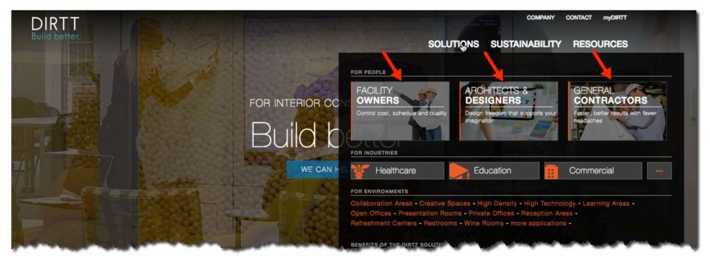
I’ve noticed a lot of building product websites have buttons on their home page for “architects” and “contractors.” Sometimes even for owners (like in the following example from DIRTT’s website).
dirttdirttdirttdirttdirtt

Those buttons help the manufacturer guide website visitors through the various pages and features. Helping to customize the user experience as best they can. Through the use of these buttons, they can highlight their products’ benefits that are specific to that user type.

If you feel this is a smart move for your product’s website — my question to you is, “Why don’t you add another button that says ‘Design-Build’?”

That way, you can speak directly to the design-build team and highlight the benefits that the whole team can appreciate and see as valuable. I haven’t seen anybody else doing this yet, so do it right now and you’ll beat your competitors to the punch.

Positioning your company as a resource for the Design-Build world…

One thing to consider with a growing market like this is there are new designers and builders entering the market all the time. Just like you, they saw the potential and decided to jump in.

What if you were the one bringing them up to speed on design-build best practices? What if you became the resource they came to for advice on getting ahead?

If you follow my advice, you’ll be doing some detective work to better understand the design-build business. Why not take all that research and make it available to your design-build prospects? Show them how to save time, save money and to be more efficient on their next (or first) design-build venture.

That would put you in a good position, don’t you think?

Become that thought leader for the industry, and selecting your product will become a no-brainer for the design-build team.

This is where you develop that content marketing you’ve heard so much talk about.

It’s not about writing how great your product is, or why they should buy from you. It’s about providing your insights about your shared industry. It’s about becoming that resource the designer or contractor comes to learn how to do things better.

Building your marketing arsenal for the Design-Build world…

As a building product manufacturer, you have various channels through which you can approach any market.

Each of them has different paths to follow.  For design-build, one path is selling the architect on your product and arming him or her with the material to sell the contractor — who will then need to sell the owner.

That can be a challenge to figure out how to get all those marketing pieces into the mix and ensure they get in the right hands. What if there was a way to do all that with a single piece…

Enter 3D visualizations done right…

Should you have three different pieces of content developed to make sure you can sell your building product to each stakeholder?
Or… is there a way you can have a single piece developed that would be visually appealing and clarifying for all stakeholders?

One of my goals, as I work with different building material marketers, is to create 3D renderings, animations, and details that help minimize the company’s marketing “moving parts.”

By that, I mean that I try to make their marketing easier by creating product visualizations that can explain their product and its benefits in an appealing and simple manner. So it’s easily understood by a wide range of user types.

So they might be able to use a single content piece to market their building product to all of the stakeholders on a building project.

Why make things complicated? Or as Bruce Lee once said: “It’s not the daily increase but daily decrease. Hack away at the unessential.”
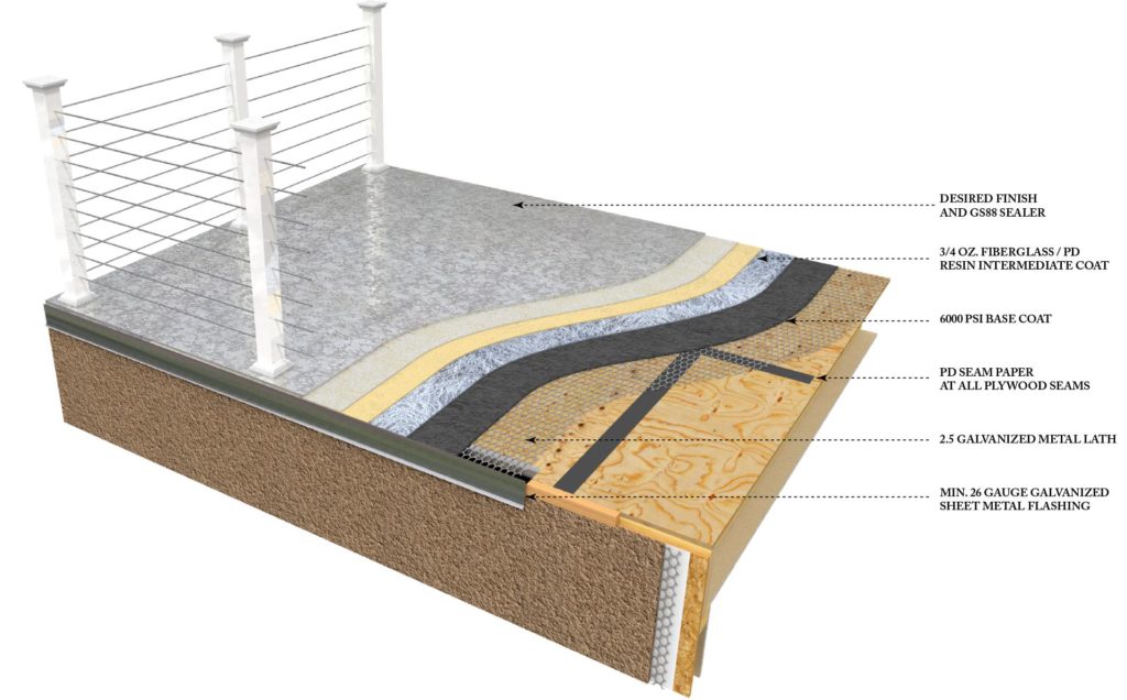
Here are some examples of visualizations I’ve created with my clients to simplify and enhance their marketing efforts…   Notice the emphasis placed, not only on the technical benefits the products may have once they are installed, but the emphasis on how they are installed, how they save time and how they dont require a contractor to stop and learn something new or do something out of his “comfort zone”.


Pli-Dek System for Concrete Decking on Wood Structures

Pli-Dek System for Concrete Decking on Wood Structures

dirtt

Technical help for the Design-Build world…

The final recommendation I’d like to make today revolves around the technical materials you provide to your prospects. What are you making available to make the design-build team’s lives easier and making it easier to choose your products?

Technical details and BIM models

The design-build team’s goal of meeting tighter deadlines and keeping design costs down, makes quick, easy access to your product’s technical details and BIM components all the more important.

At the same time, it’s also just as important to make sure your technical details are easy to digest and understand. As I said, you need to make sure your details are understood by as many of the project’s stakeholders as you can. It’s not just a “nice-to-have” kind of thing… it’s a must-have in the design-build world, if you want to make an impact.

Installation instructions

I’ve said it many times and in many ways, but your product needs to have installation instructions that are clear and concise. Think about it this way…

If you were a design-build firm, you’d want to look at the install instructions before picking a new product — you don’t want any surprises. For that reason, installation instructions are a valuable sales tool (or potential sales killer) in the design-build world.

Conclusion

As you can see, the design-build market has a huge potential and is definitely worthy of your consideration. If you aren’t already looking for ways to get into that market, drop everything and start today. All indicators point to its increase in the coming years.

Consider focusing at least some of your marketing efforts toward design-build projects. And if I can be of any help in developing your images and details using 3D visualization – let me know. I’d love to chat about it.

About the Author :

Jason Yana has 2 decades of experience in architectural technology, 3d graphics and construction marketing. This unique combination provides highly-effective visual representations of building products that fuel marketing and support efforts.

His award-winning body of work informs, inspires and educates building product customers.

Make Your Building Materials Web Site Resonate With Architects

Make Your Building Materials Web Site Resonate With Architects

6 questions you should be answering to get more quality leads


Is your building materials website currently doing its JOB? Is it attracting architects and contractors and then converting them into a good lead for you to follow up with?

I’m guessing not. Not that it’s your fault. You just did what everybody said you were supposed to do. Or you followed what it looked like everybody else was doing.

It doesn’t seem that long ago that companies were racing to get online. Just getting a website put up, so you appeared to be a viable company.

But as you’ve most likely seen, that’s just not enough anymore. Architects are increasingly looking to your website before anything else, as a way to decide if your product is right for them. So doesn’t it make sense to make sure your website has the information they want and need to make a decision. 

Now is the time that you need to step back and think critically about what questions you need to be asking yourself and others in your company. The questions that will help lead you to the answers to drawing more high-quality leads to your website and getting them to “raise their hand,” asking for more information.

Six key questions you should be answering…


1 – How does an architect choose one product over another?

According to a recent architect research report from Venveo, 70% of the architects surveyed said case studies are the most helpful type of content when deciding on what product to spec. The same amount of architects said they felt having a way to order product samples quickly and easily was another factor a manufacturer’s website should have.

According to building materials marketing expert, Mark Mitchell, when we look at what the primary motivation of most architects, their main concern is their reputation.

The overarching thing that helps an architect make the sometimes tough decision to risk their reputation and specify a new or unfamiliar product is to have a better understanding of it. Knowing how it works… How it fits into the overall picture of the building project they are designing…

If your website can help them get to that point of better understanding your product, then if and when they finally do call you, the conversation can be a much different one. Instead of starting at ground zero – explaining your product’s features and benefits – they’re coming to you with that base knowledge already in their head.

And they’ll just be looking for clarification on how your product can best solve their specific situation.

And as we’ve discussed before, in a previous blog post,  video is a proven way to get your prospects to understand your product.

2 – How does an architect research your products online?

Does he Google it, or does he go to an online product site like ARCAT.com, or Sweets?

If you’ve been reading my blog for a while, you’ve heard me talk about how the “old school” Sweets catalogs were the catalyst that inspired me to take the path I’m now on – Helping building material manufacturers like you better explain your products through visualizations.

But how viable are directories like Sweets and ARCAT anymore? Do architects still use them like you think they do?

If you were to walk into any architecture firm today, chances are you’d see a lot of empty shelves where the directories and vendor catalogs used to be. Unless, of course, they have an interior design department…

The interiors folks still tend to have many sample books on hand, since their role requires having something a client can see and touch first hand, so they can “sell” them on using it. That might be a good clue — if you have something that requires good visuals to sell through the architect or designer… that might be a good thing to get into your prospects’ hands…

But for the most part, architects are going to your website for the most current information (and education) they can get their hands on.

3 – What can a manufacturer do to help architects?

This question is key. You need to focus your time and attention on answering this big question. How do you do that?

Ask the architects. Send out short surveys to your e-mail list to get feedback… (You are collecting leads on your website aren’t you?!? That’s another post altogether, but for now just know that you need to be doing that…) Add a pop-up survey on your website asking a few key questions to see what you could do differently.

A great book to read on how to find out exactly what your customers want is “Ask” by Ryan Levesque. (Highly recommended.)

So find out what it is they’re looking for. Are there certain tools or reference guides regarding your product that you could add to your website or handouts that you could brand and serve as a resource he or she will keep coming back to?

4 – What can a building product manufacturer do to better his odds of getting specified?

E-D-U-C-A-T-E. That’s the best and most prevalent advice you’ll find out there. You have to educate your prospects – without selling them. Of course, there’s a time when you do have to ask for the sale, but first you need to be a resource to them.

Once they know, like, and trust you, then they’re much more likely to specify your products and keep returning to you to learn more about how your products can solve their problems. Don’t underestimate the power of this one.

Of course, you’ll want to refer back to the last question to figure out exactly which topics they’re most interested in.

5 – Do architects still want AutoCAD details?

The simple answer is “Yes.” Although many architects have moved to 3D programs, like Revit, they still put their detail sheets together as 2D drawings. It’s here that your AutoCAD details can help guide them, and show how your product might interface with the other materials in their project.

So these 2D details are still a necessity, but certainly not the only CAD resource you need to provide. And certainly not the only visuals you should use to make sure the architect knows how your product fits into their project.

6 – How does BIM come into play with all of this? Is it worth your investment?

Here’s where that annoying answer comes in: “It depends.”

It depends on your product…

Some architects working on smaller projects, might grab your product’s Revit family and drop it into their model. But this is typically limited to equipment and stand-alone objects.

If you have a component that is a part of a wall system, it’s unlikely they’ll be looking to use that. However, if you have a finish product, they would definitely like to the ability to include your product’s finish and or patterns in their renderings.

It can also depend on the firm. Not all firms who use Revit are using BIM. Often, a firm will limit how many manufacturer-produced Revit families an architect can use in their project’s Revit model. If there’s too much information plugged into a large model, it can start to bog it down.

This is just one more reason you need to gain an understanding of who your target market is and what they need from you.

Conclusion


It’s a new world out there, and our industry is constantly changing. The successful building material companies will be the ones who learn to adapt and change with it. We’ve covered several things here that you can do right now to make sure you’re among the successful ones…

Make sure you clearly identify who your target market is. Connect with them and ask them what they’re looking for and how you can be most helpful. Find the gaps and fill them. You can be the resource they come to. You just need to approach your marketing plan with clarity as the main goal.

Clarity for you: who your prospect is and what they want.

Clarity for your prospect:  who you are and how your products and services can provide them with the solutions they need.

About the Author :

Jason Yana has 2 decades of experience in architectural technology, 3d graphics and construction marketing. This unique combination provides highly-effective visual representations of building products that fuel marketing and support efforts.

His award-winning body of work informs, inspires and educates building product customers.

Visualizations Emotionally Connect Building Products with Customers

Visualizations Emotionally Connect Building Products with Customers

Start with the end in mind

If your product is any darn good, it makes someone’s life better, if only for a moment.   Ponder, if you will, for a moment how your product is going to make a customer’s life better in some way.   Will it save them time?  will it save them money?   Will it make their home, or commercial building more efficient, more attractive, more structurally sound?    Are you thinking about it?   hold that thought  . .

Marketing is Empathy

Knowing with whom you are speaking to is crucial for marketing.   This holds true with the images you use of your products.   Understanding the problems, difficulties and challenges of your customers is a great place to start.   What are the needs your product is fulfilling and what are the feelings behind those needs?   If your visual communications can speak to those feelings, you will make a more intimate connection and have far more success.

Example #1 Strength & Stability

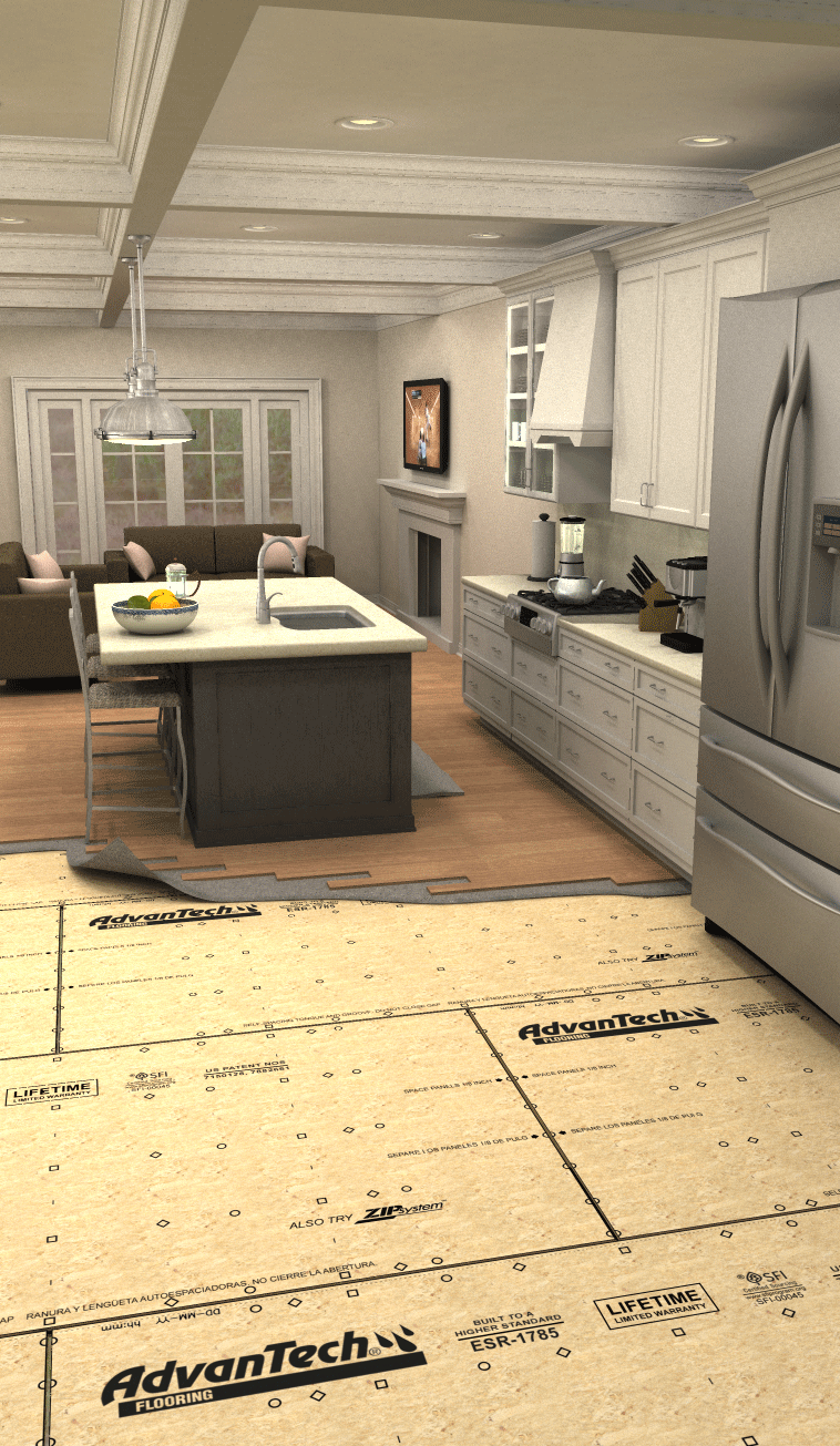
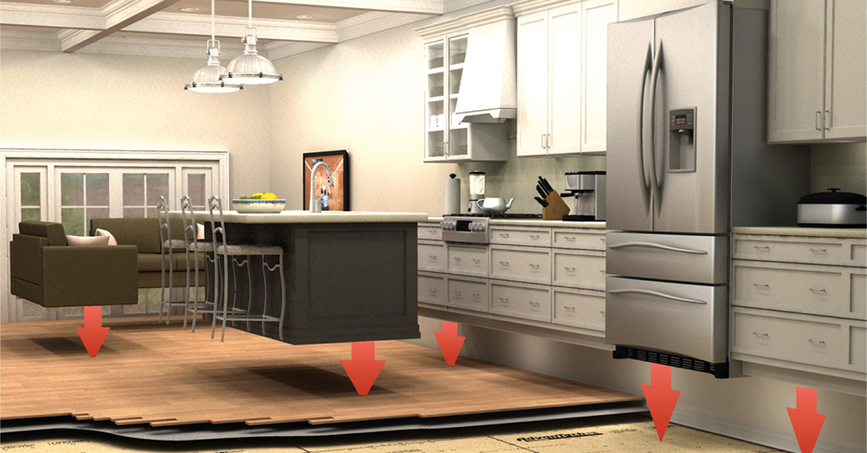
This product, like many I am asked to illustrate, is never seen once a home is built.  It goes under the floors and provides superior durability and strength.   To communicate the feeling of stability and strength to a homeowner, we decided to take them to a kitchen.   A kitchen they could see their family cooking, gathering and dining in.  Using photorealistic rendering, we then peeled away the floor, showing what is beneath the kitchen of their dreams – the solid foundation on which it sits.

whitekitchenpreview12

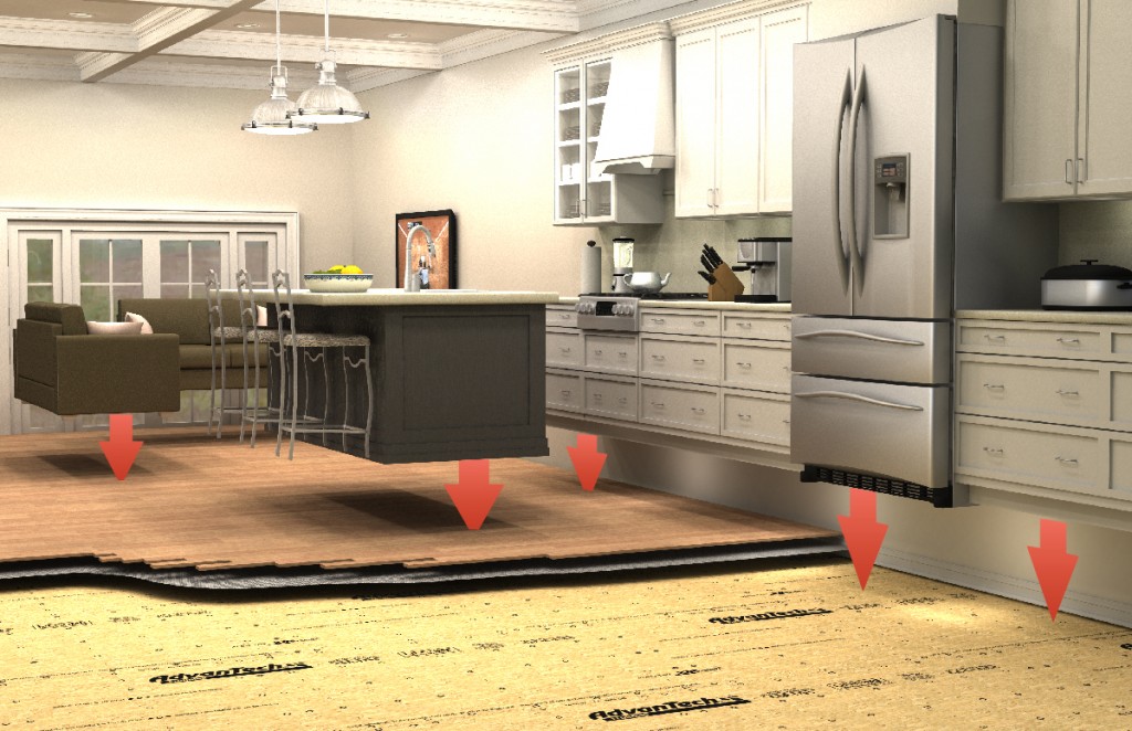
In the second illustration we lifted the kitchen off the floor and used arrows to depict the weight of the situation.  In the final layout the actual weights of each item are estimated and printed on the arrows themselves to further drive home the concept.

gravitykitchen1200

Example #2 Protection – Safety – Weatherability

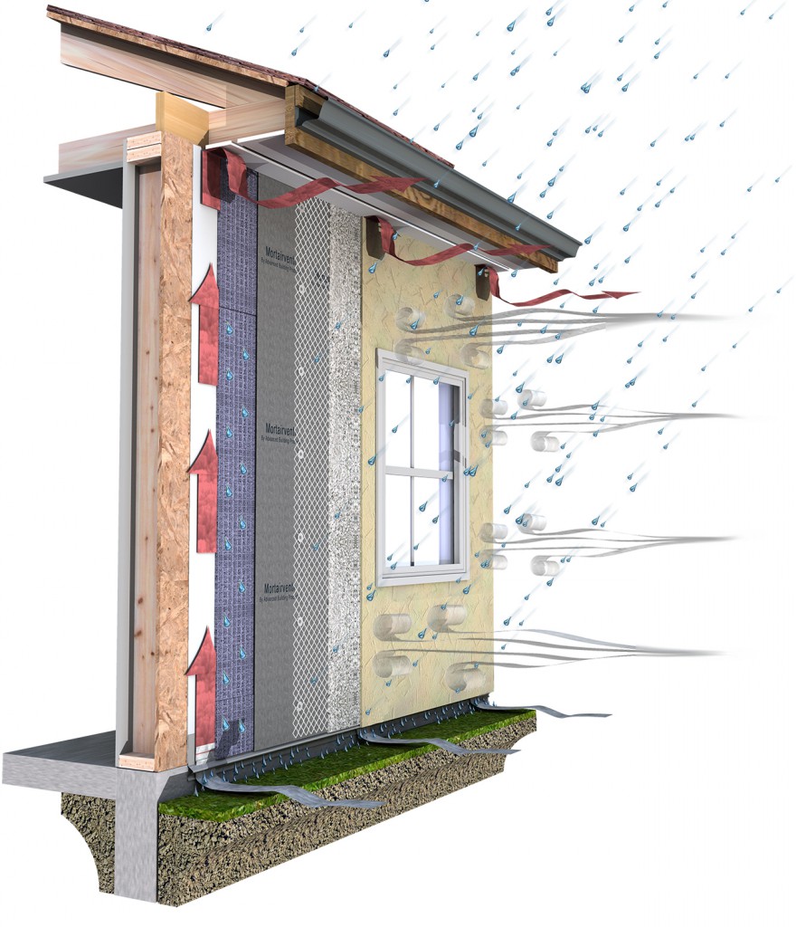
So many building products are about keeping out the elements.   Keeping water out of a structure is always one of the biggest challenges.   What homeowner or building owner doesn’t worry about leaks?

rainimage

Regards and I hope you make an emotional connection today.

-JY

About the Author :

Jason Yana has 2 decades of experience in architectural technology, 3d graphics and construction marketing. This unique combination provides highly-effective visual representations of building products that fuel marketing and support efforts.

His award-winning body of work informs, inspires and educates building product customers.
Inside the Studio – Factory Tour of What I did Today

Inside the Studio – Factory Tour of What I did Today

Factory Tour

I love factory tours.  Everyone once in a while, I get to walk through a factory.   Usually it is one of my clients who manufacture building products, but I’m also addicted to watching the show “How it’s made” as well.   I’m always fascinated by how things get done.   I did a pretty interesting 3d model today and thought I’d share a little window into how I do what I do.  That will happen in the latter part of this post.

I Fired Myself Last Month

quitter

For those of you who do not know my story, I have been doing visual marketing as a side business for the last 15 years.   Up until last month, I had a full time job as the Staff Architect at a local masonry trade association.

That’s right, I’m a quitter.   John Acuff covered what it means to be a quitter in his book:

Quitter: Closing the Gap Between Your Day Job & Your Dream Job

I enjoyed it and highly recommend it to anyone looking to be their own boss. It’s been an exciting three weeks since I became a quitter and I’m adjusting well to seeing more of my beautiful wife and sweet little 1 1/2 year old daughter.


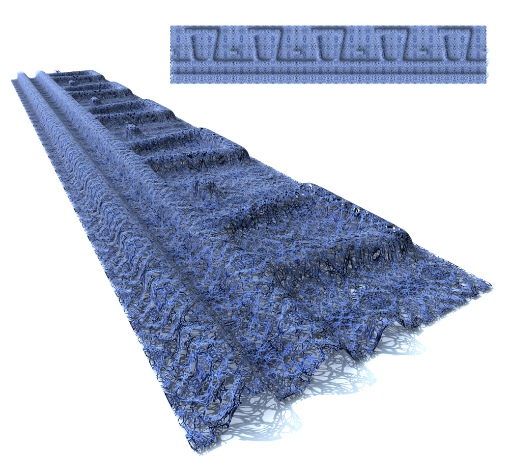
Factory Tour – 3d model & Photorealistic Rendering of a new product.

I have to admit, when I got a snapshot photo of this product, I was a little concerned about creating geometry that would accurately simulate this product.  It’s a pretty goofy shape.   The photograph I received looked like this :

photo-(2)

It is a drainage device for masonry walls, but that’s not important right now.  What is important is that this thing is made of an open weave mesh and it is formed into this dovetail shape.  It looks sort of like it goes into a press and gets pressed or stamped like a cookie sheet or something.   Regardless I had to take some basic dimensions I was given and then make a flat object that warps up and down in a curved profile in this dovetail pattern.

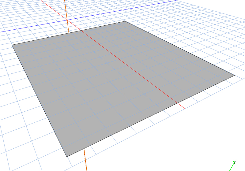
I broke it down into the most reasonable repeatable unit, which conveniently is one foot wide – with one dovetail in it.   I created a flat polygon mesh that measured the height of the finished product – 11″  and the width of this repeatable unit 12″.

It looks like this :

stepone

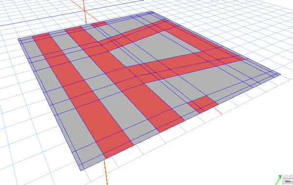
Then in two dimensions I subdivided the surface into a series of sections to control the mesh that will be created in later steps.   I’m skipping a lot of boring stuff here, but all the extra lines will help me control the behavior of the surfaces, once I subdivide them.   I have highlighted the faces that will be extruded out to create the desired shape :

steptwo

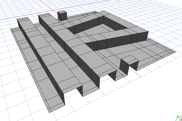
Next I take those faces and extrude them upward creating the basic shape I will be needing.  It’s still boxy and weird, but it’s getting there :

stepthree

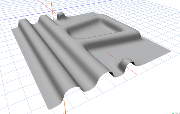
Now that I have all these control lines in place and the geometry the way I want it, I now can subdivide the surfaces :

stepfour

Now we have a smooth mesh in which the subdivision system has used those control lines i put in to calculate a smooth surface.  Thankfully I have drawn a similar product for this company that is also made of this open mesh material and have a texture already created for it.  The texture involves taking a photograph of the mesh.


Using photoshop to make it tileable, meaning if it is repeated over and over it appears seamless.    The same image is duplicated and using photoshop threshold filters, i turn the image into a black and white representation where white equals the actual object and black are the areas that will be transparent.    Once  I create the new texture, i simply define the blue color using the rgb values lifted from the original photo and then use my transparency mask to take out all the parts of the mesh you can see through.

This is what the transparency mask looks like – pretty strange looking, but the black parts will be transparent and the white parts will have the blue color from the original photo on it.


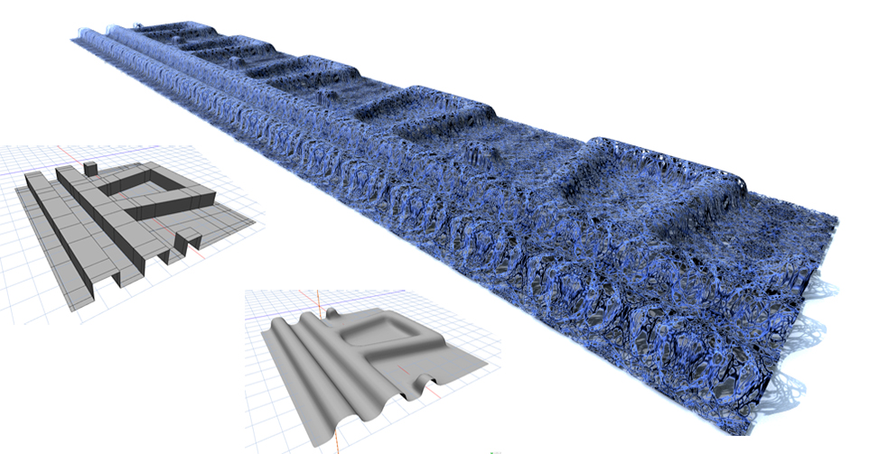
Texture applied – skipping a bunch of steps in the texture process but you get the idea.   I then replicated the shape 5 times to arrive at the final product.  Set up some lighting parameters and a ground plane and here is the result.  Clicking on the image gives you a full size view.


mortarbreakdt

Interactive 3d Renderings Take Products for A Spin

Interactive 3d Renderings Take Products for A Spin

360 Degree Interactive Rotation of 3d Rendered Images

A great visual tool for showcasing products in a visually appealing way is the use of 360 degree interactive objects.   The ability for the viewer to grab your product and spin it around is one more  great visual marketing tool that can help demonstrate a complex product or assembly in 4 dimensions.   This technology can be made to run in any browser environment.   For the most compatibility, using html5 is the best option.    The examples below are in html5 and can run on most internet browsers, as well as on android and iPhones, Ipads, etc.  without the need for a plugin.

Example 1 – Interactive Spin of a Product Rendering


Example 2 – Interactive Spin of an Entire Rendered Wall Assembly

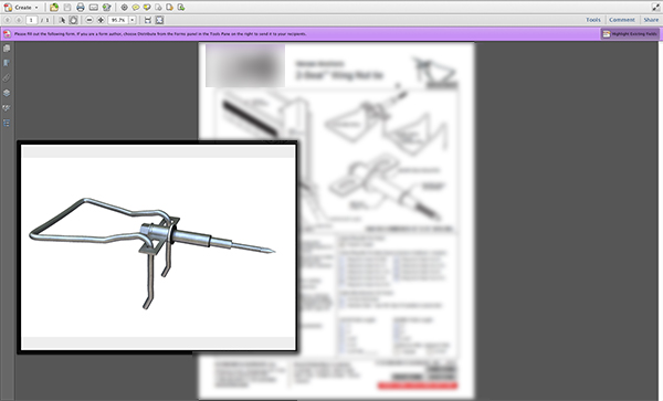
Example 3 – A 3d Interactive Model Inside a PDF Data Sheet

  • Just about every product manufacturer uses pdf files for their submittals and for product data sheets
  • Adobe Acrobat is installed on most computers
  • 3d Interactive models can be embedded right in a pdf

Just some food for thought, if you’d like to have the nicest product data sheets in your industry or showcase your products on your web site with more flair, let’s talk!

Regards,


Jason Yana