What does visual marketing of construction products have to do with McDonald’s?
Well here comes the stretch.
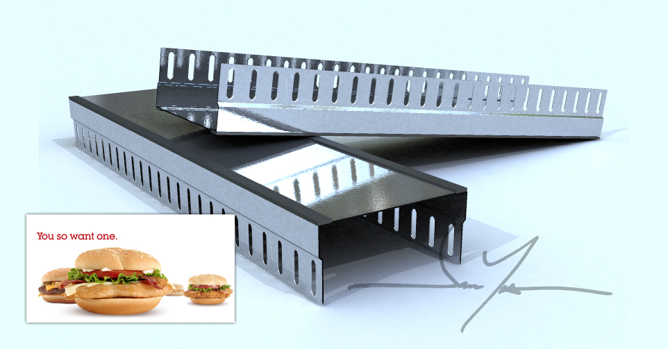
Ever notice how the images they use of a Big Mac in commercials are always so perfect looking? What about on those big pictures they throw up on their menus at their restaurant locations? They know the power of visual communication. There is a company they hire who painstakingly pours over every detail of the sample sandwiches they make with the sole purpose of photographing them for marketing materials.
Maybe I watch too much documentary tv on the science channel, but I happened to catch the show about how they do that. It’s intense and it has to be expensive, but they do it. They know what they are doing.
When I look at catalogs and marketing materials on web sites for building products, the products usually look lame.
Here’s a cold formed metal framing part – It fireproofs the top of a wall – or so they tell me.
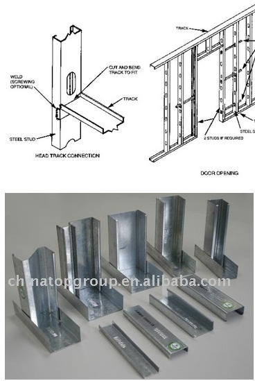
Anyway looking around the internet to see what I am competing with when I do a rendering of this product, here’s what I come up with:
I think we can do better – way better as an industry and learn from McDonald’s a little bit. So there hamburgers never actually look as good as the products they show in the commercials and on the menus – maybe that’s not such a big deal.
Maybe we can take a page from this playbook and send our products to beauty school a little bit.
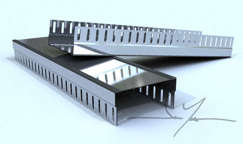
Here’s my attempt at it, for what it’s worth – 3d subdivision surface model and rendering of Cemco Fastrak 1000


